
ComfyUI-RE-CustomUtils
A collection of custom nodes for ComfyUI.
Nodes (9)
Bring back the A1111 BREAK keyword — without the ConditioningConcat spaghetti
A character sheet for your prompts — same face, every batch
Mail-merge for your prompt — a template with 10 slots you can feed from anywhere
A dropdown for prompt fragments — with a cartesian combos feature that punches way above its weight
Wildcard blocks without the wildcard syntax — one spinner, every prompt variant
The switcher that reads its own wires — route between connected prompts
Your prompt as a clickable checklist (with a dice roll on the side)
The fastest dropdown in the pack — type a list, get a value and an index
One node that replaces your whole model-loading cluster — driven by JSON files
ComfyUI - RE-CustomUtils
A collection of custom nodes for ComfyUI.
[!NOTE] This project was inspired by the cookiecutter template, though the full architecture is a bit different.
Quickstart
- Install ComfyUI.
- Install ComfyUI-Manager
- Look up this extension in ComfyUI-Manager. If you are installing manually, clone this repository under
ComfyUI/custom_nodes. - Restart ComfyUI.
Nodes
PromptPresetSelector
Inputs
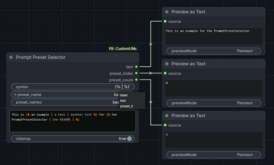
syntax(str), default to{% | %}— defines the opening tag, separator, and closing tag as a single field, space-separatedpreset_index(int), 0-based, default to0— loops both ways within rangepreset_name(combo) — dynamic dropdown, active whenpreset_namesis filledpreset_names(str), optional — comma-separated list of preset names. Ex:neutral, happy, sad. If fewer names than presets, remaining are auto-named (preset_2,preset_3...). If more, extra names are ignored.text(str), multiline textarea supporting preset blockscleanup(bool), default toTrue
Outputs
text(str) — the formatted text, with preset blocks resolvedpreset_index(int) — the selected indexpreset_count(int) — the number of presets found across blocks
Usage
Include preset blocks in your text using the syntax defined in the syntax field. Each block holds options separated by the separator. Depending on preset_index, the matching option is injected and the block markers are removed.
This is {% an example | a text | another text %} for {% the PromptPresetSelector | the README | %}
preset_index=0→This is an example for the PromptPresetSelectorpreset_index=1→This is a text for the READMEpreset_index=2→This is another text for
Empty presets are allowed — the block is simply replaced by an empty string.
Custom syntax
The syntax field allows changing the opening tag, separator and closing tag. Format is always open_tag separator close_tag, space-separated.
<< / >>
Would match blocks like << option_a / option_b >>.
Preset names
When preset_names is filled, preset_index is replaced by a dynamic dropdown (preset_name) built from the comma-separated names. The dropdown resets to the first preset when activated.
If fewer names than presets are defined, remaining entries are auto-named (preset_2, preset_3...). If more names than presets, extra names are ignored.
Preset references
Inside a preset, you can reference a previously declared preset using $N (0-based index).
{% base style | $0, hat | $1, jewelry %}
preset_index=0→base stylepreset_index=1→base style, hatpreset_index=2→base style, hat, jewelry
References are resolved recursively — $1 in preset 2 resolves preset 1, which may itself reference preset 0.
Rules:
$Ncan only reference a preset with a lower index (forward references are not allowed)$Nmust be within range- Circular references raise an error
Cleanup
When cleanup is enabled, the following are removed from the output:
- Spaces before commas
- Multiple consecutive spaces
- Empty or comma-only parentheses and brackets
- Residual commas after opening or before closing parentheses
- Double or empty commas
- Leading commas
- Empty lines
Validation
The node runs the following checks and stops the workflow on error:
syntaxmust contain exactly 3 space-separated partsopen_tagandclose_tagmust be different- All preset blocks in
textmust have the same number of options preset_indexmust be within range
PromptOptionPicker
Inputs
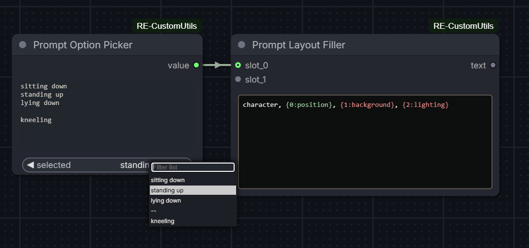
options(str) — one option per line. Empty lines are allowed and displayed as--in the dropdown, with an empty string as value.selected(combo) — dynamic dropdown built from theoptionsfield.
Outputs
value(str) — the selected option, or""if--is selected.
Usage
Fill the options field with one option per line. The dropdown updates
automatically as you type.
sitting down
standing up
lying down

kneeling
The empty line above produces a -- entry in the dropdown, which outputs
an empty string. If the field is empty, the dropdown resets to --.
Labels
Options can be labeled using the label $: value syntax. The label is shown in the dropdown, but the real value is transmitted on output:
neutral $: character, simple background
happy $: character, smile, laughing
sad $: character, crying
For unlabeled options, use $: value — the option is auto-named option_N:
$: character, simple background
$: character, smile
Cartesian product blocks
Use @combine / --- / @end blocks to generate all combinations of multiple lists:
@combine
from front
straight-on
from side
---
from above
from below
---
close-up
full body
@end
Each --- separates a new list. The block expands into all combinations joined by , :
from front, from above, close-up
from front, from above, full body
from front, from below, close-up
...
Multiple @combine blocks are allowed and processed independently. A --- outside a block is treated as a literal option.
Validation
The node stops the workflow on error if:
- A
@combineblock is opened inside another - A
@endis found without a matching@combine - A
@combineblock is never closed
PromptLayoutFiller
Inputs
template(str) — multiline text with placeholders. Supports{N}or{N:label}syntax whereNis the slot index (0-based) andlabelis a purely visual annotation.cleanup(bool), defaultTrueslot_0toslot_9(str, connectable) — values injected into the corresponding placeholders. Slots are revealed one by one as the previous one is connected. Up to 10 slots supported.
Outputs
text(str) — the template with all placeholders resolved.
Usage
Write a template in the text field using placeholders:
character, {0:position}, {1:background}, {2:lighting}
Connect a node (e.g. a PromptOptionPicker) to each slot. The placeholder
is replaced by the connected value at execution.
Presets
The node supports saving and recalling slot configurations as named presets, stored directly in the workflow.
[preset dropdown] [➕] [💾] [🗑️]
[📋 Export]  [📥 Import]
| Button | Action |
| ---------- | ------------------------------------------------------------------ |
| ➕ | Creates a new preset from current slot values (prompts for a name) |
| 💾 | Overwrites the selected preset with current slot values |
| 🗑️ | Deletes the selected preset and recalls the next one if available |
| 📋 Export | Copies all presets as JSON to clipboard |
| 📥 Import | Pastes and loads presets from JSON |
Presets are sorted alphabetically. Recalling a preset pushes the saved values into connected source nodes. If a saved value is no longer available in a source node, or the source node is disconnected, an error is raised.
Cleanup
Same rules as PromptPresetSelector. Useful when a connected slot outputs an empty string, leaving residual commas or parentheses.
Validation
The node stops the workflow on error if:
- The template is empty
- A placeholder index exceeds the maximum slot index (9)
- A placeholder is used but the corresponding slot is not connected
Typical workflow
[PromptOptionPicker] → slot_0 ┐
[PromptOptionPicker] → slot_1 ├→ [PromptLayoutFiller] → text
[PromptOptionPicker] → slot_2 ┘
Each PromptOptionPicker manages its own list of options independently.
Slot lengths do not need to match.
PromptSwitch
Inputs
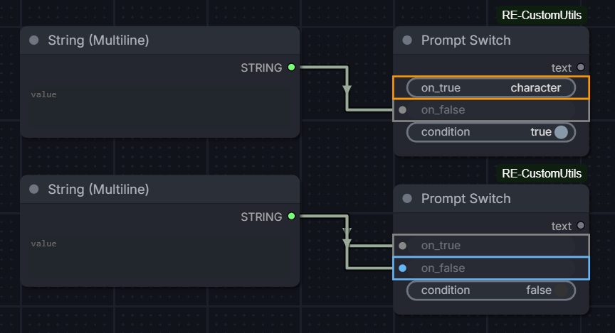
on_true(str) — value returned when condition isTrue. Accepts direct input or connected node.on_false(str) — value returned when condition isFalse. Accepts direct input or connected node.condition(bool), defaultTrue— controls which input is routed to the output.
Outputs
text(str) — the selected value based on condition.
Usage
Connect or type a value in on_true and on_false. Toggle condition to switch between them.
If the node is bypassed, an empty string is returned.
Editor
Input ports and widget borders are colored based on the active condition:
- Orange: active input when condition is
True - Blue: active input when condition is
False - Gray: inactive input Colors are only shown when an input is connected or has a value.
PromptRouter
Inputs
selected(str, internal) — stores the active selection for workflow persistence._sub_selected(str, internal) — stores the active sub-router selection.input_0toinput_9(str, connectable) — values to route. Slots are revealed one by one as the previous one is connected. Up to 10 slots supported.
Outputs
text(str) — value of the selected input.index(int) — index of the selected input.
Usage
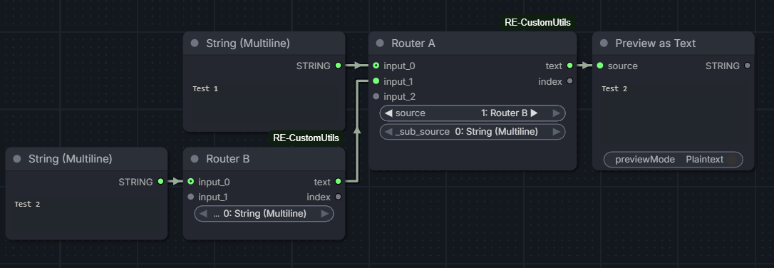
Connect nodes to the input slots. The dropdown automatically populates with the title of each connected source node, prefixed by its index:
0: position
1: background
2: lighting
Select the active input from the dropdown. The node outputs the value of the selected input.
If a connected node is bypassed, the output is an empty string.
Sub-router
If a connected source node is itself a PromptRouter, it is marked with a ▶ indicator in the dropdown:
0: position
1: Router B ▶
2: background
Selecting it reveals a second dropdown populated with the options of the child router. The parent outputs the value selected in the child dropdown.
Changing the selection in either the parent sub-dropdown or the child router updates both in sync. Multiple parents connected to the same child router all stay synchronized.
Sub-routing is limited to one level deep.
Special node integration
When a connected source node is a PromptOptionPicker, PromptLayoutFiller, or PromptPresetSelector, it is marked with a ◆ indicator in the dropdown:
0: position ◆
1: Router B ▶
2: background
Selecting it reveals a third dropdown populated with the options or presets of that node. The selection is synchronized in both directions: changing the value in the Router updates the source node, and changing it in the source node updates the Router.
This also works one level deep through a sub-router:
[Router] → [sub-router ▶] → [OptionPicker ◆] → [value dropdown]
Editor
- The dropdown updates automatically when source nodes are connected, disconnected, or renamed.
- The active selection is preserved across workflow saves, reloads, and undo/redo.
Known limitations
- If a child router's connections change while it is selected in the parent, the parent dropdown may not update immediately. Reconnecting or modifying the parent will trigger a refresh.
- If a getter node is connected to the router, the getter's name will be in the router's dropdown but, the getter being "invisible" (directly getting the setter's value), the value would be provided by the node before the setter. Thus, the router would receive an empty string, because of not getting the right node. Linking the getter with a string node before connecting to the router solves the issue.
QuickCombo
Inputs
options(str) — comma-separated list of options typed inline. Ex:neutral, happy, sadselected(combo) — dynamic dropdown built from theoptionsfieldone_based(bool), defaultFalse— ifTrue, the index output starts at1instead of0
Outputs
value(str) — selected optionindex(int) — index of the selected option (0-based by default)
Usage
Type a comma-separated list in the options field. The dropdown updates automatically as you type.
neutral, happy, sad, angry
Toggle one_based to match the indexing convention of other nodes in your workflow.
Differences from PromptOptionPicker
| | QuickCombo | PromptOptionPicker |
| ----------------- | ---------------------- | ----------------------- |
| Input format | Inline comma-separated | Multiline, one per line |
| @combine blocks | No | Yes |
| Labels ($:) | No | Yes |
| Empty options | No | Yes (--) |
| Use case | Quick setup | Advanced lists |
StyleLoader
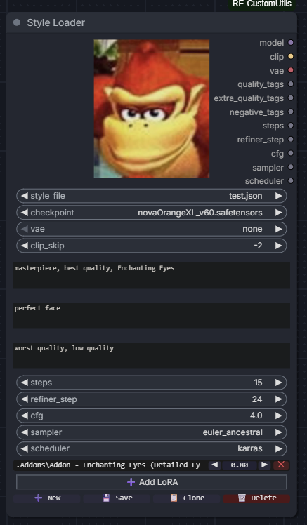
Inputs
style_file(combo) — dropdown listing all.jsonfiles found recursively under thestyles/folder. Supports subfolders (e.g.anime/illustrious.json).checkpoint(combo) — model checkpoint to load.vae(combo) — VAE override. Selectnoneto use the checkpoint's built-in VAE.clip_skip(int), default-2— number of CLIP layers to skip. Set to-1to disable.quality_tags(str) — positive quality prompt, passed through as a string output.extra_quality_tags(str) — extra positive quality prompt, passed through as a string output.negative_tags(str) — negative quality prompt, passed through as a string output.steps(int), default15— number of sampling steps.refiner_step(int), default24— step at which a refiner pass begins, if used.cfg(float), default4.0— classifier-free guidance scale.sampler(combo) — sampler name, sourced from ComfyUI's own sampler list.scheduler(combo) — scheduler name, sourced from ComfyUI's own scheduler list.loras_data(str, internal) — serialized LoRA list for workflow persistence.
Outputs
model— loaded model with LoRAs applied.clip— CLIP encoder with clip skip and LoRAs applied.vae— VAE (overridden or from checkpoint).quality_tags(str) — positive prompt passthrough.extra_quality_tags(str) — extra positive prompt passthrough.negative_tags(str) — negative prompt passthrough.steps(int)refiner_step(int)cfg(float)sampler(str)scheduler(str)
Usage
Style files are .json files stored under the src/data/styles/ folder at the root of the extension. Subfolders are supported and reflected in the dropdown after a page refresh.
A style file contains all parameters for a generation setup:
{
  "checkpoint": "model.safetensors",
  "vae": "none",
  "clip_skip": -2,
  "loras": [
    { "name": "lora.safetensors", "weight": 0.8 }
  ],
  "quality_tags": "masterpiece, best quality",
  "extra_quality_tags": "perfect face",
  "negative_tags": "worst quality, low quality",
  "steps": 15,
  "refiner_step": 24,
  "cfg": 4.0,
  "sampler": "euler_ancestral",
  "scheduler": "karras"
}
LoRAs support a single weight (applied to both model and clip), or separate model_weight and clip_weight.
Preview
You can embed a preview image for each of your styles by putting an image with the same name as the style in its directory. The node looks for png, jpg, webp or jpeg files, and display the image if found on top of the style_file input, next to the outputs.
Editor
The node includes a built-in styled editor:
- All fields are native ComfyUI widgets — checkpoints, VAE and samplers have built-in search and autocomplete.
- LoRA rows are displayed as canvas widgets, one per line, with a name picker, weight control, and remove button.
- The weight can be adjusted by dragging horizontally, clicking the
◀/▶arrows, or clicking the value to type it directly. - Clicking the LoRA name opens a searchable dropdown.
Actions
| Button | Action |
| ---------- | ------------------------------------------------------- |
| ➕ New | Creates a new style file from a blank template |
| 💾 Save | Saves current widget values to the selected style file |
| 📋 Clone | Saves current values to a new file |
| 🗑️ Delete | Deletes the selected style file (requires confirmation) |
Adding a new style file or refreshing an existing one takes effect immediately without restarting ComfyUI. Adding new files to the styles/ folder externally requires a page refresh (F5) to appear in the dropdown.
CharacterLoader
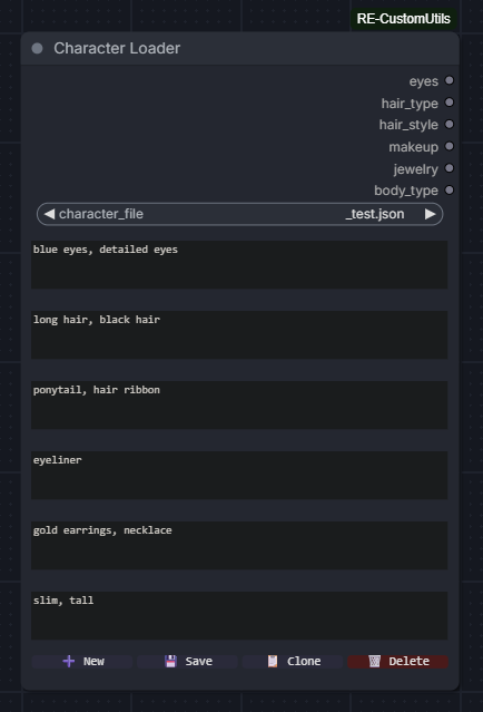
Inputs
character_file(combo) — dropdown listing all.jsonfiles found recursively under thesrc/data/characters/folder.eyes(str) — eye description tags.hair_type(str) — hair type tags.hair_style(str) — hair style tags.makeup(str) — makeup tags.jewelry(str) — jewelry tags.body_type(str) — body type tags.
Outputs
eyes(str)hair_type(str)hair_style(str)makeup(str)jewelry(str)body_type(str)
Usage
Same file system as StyleLoader, JSON files stored under src/data/characters/. Subfolders are supported and reflected in the dropdown after a page refresh.
{
  "eyes": "blue eyes, detailed eyes",
  "hair_type": "long hair, black hair",
  "hair_style": "ponytail, hair ribbon",
  "makeup": "eyeliner",
  "jewelry": "gold earrings, necklace",
  "body_type": "slim, tall"
}
Each field is output as a plain string, ready to be plugged into any other string input.
Actions
| Button | Action |
| ---------- | ----------------------------------------------------------- |
| ➕ New | Creates a new character file from a blank template |
| 💾 Save | Saves current field values to the selected character file |
| 📋 Clone | Saves current values to a new file |
| 🗑️ Delete | Deletes the selected character file (requires confirmation) |
BreakEncoder
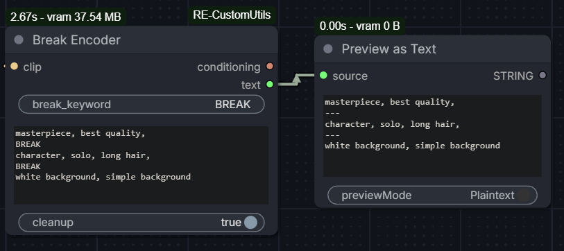
Inputs
clip(CLIP) — CLIP encoder, typically from a checkpoint loader.break_keyword(str), defaultBREAK— keyword used to split the prompt into blocks. Case-sensitive.text(str) — multiline prompt with break blocks.cleanup(bool), defaultTrue— applies prompt cleanup on each block before encoding.
Outputs
conditioning(CONDITIONING) — concatenated conditioning from all blocks.text(str) — cleaned blocks joined by\n---\n, reflecting exactly what was encoded.
Usage
Write a prompt with break blocks separated by the keyword:
masterpiece, best quality,
BREAK
character, solo, long hair,
BREAK
white background, simple background
Each block is encoded separately then concatenated, equivalent to ComfyUI's ConditioningConcat chained across all blocks. This matches the behavior of A1111/Yodayo's BREAK keyword.
The text output reflects exactly what was encoded after cleanup, useful for debugging:
masterpiece, best quality
---
character, solo, long hair
---
white background, simple background
Cleanup
When enabled, applies the same cleanup rules as PromptPresetSelector on each block individually. Blocks that become empty after cleanup are silently filtered out.
Validation
The node stops the workflow on error if:
clipinput isNonetextis empty or whitespace onlybreak_keywordis empty or whitespace only- No valid blocks remain after splitting and cleanup
Web
contentEditable editor
Some text widgets are replaced by a contentEditable div that provides syntax highlighting.
Supported widgets and nodes:
textwidget inPromptPresetSelectoroptionswidget inPromptOptionPickertemplatewidget inPromptLayoutFiller
Colors update in real time while editing or changing other widget's values and pasting always inserts plain text, stripping any HTML formatting.
PromptPresetSelector:
- Orange: tags and separators
- Gray: inactive presets
- Blue:
$Nreferences on the active preset
PromptOptionPicker:
- Orange:
@combine / --- / @endtags - Cyan: labels
- Gray:
$:separators
PromptLayoutFiller:
Placeholders are highlighted in the editor:
- Green: slot is connected
- Red: slot is referenced but not connected
Keyboard shortcuts
| Shortcut | Action |
| ----------- | ---------------------------------------------------------------------------------------------------------- |
| Ctrl+Up | Increase weight of selected text or word under caret by 0.1. Ex: tag → (tag:1.1) |
| Ctrl+Down | Decrease weight of selected text or word under caret by 0.1. Ex: (tag:1.1) → tag when reaching 1.0 |
The selection is preserved after each keypress, consistent with ComfyUI native behavior.
Tests
This project uses pytest and pytest-aiohtttp for its tests, and uv for the versioning.
After downloading uv, just run:
uv sync --dev
.venv\Scripts\activate.bat    # Windows
source .venv/bin/activate     # Linux/MacOS
and you should have the dependencies ready.
Then, to run the tests:
uv run pytest
Limitations
Currently, the relative imports in the root __init__.py file are preventing pytest from running. The solution is to change all the imports from .src.xxx to src.xxx for the tests, and then revert them for the ComfyUI execution.
TODO
PromptPresetSelector
- Add a field to easily concatenate text at the end of the output
- Wildcard mode for presets (randomly selected, index to -1 or -2?)
- Original
preset_namesunchanged if changed from aPromptRouter(even though the value is still the correct one)
PromptRouter
- Add support for more sub-routing levels?
- Support special node integration beyond one sub-router level?
StyleLoader
- LoRA toggle on/off per row
- Separate model/clip weight per LoRA on UI
- Better LoRA row style
CharacterLoader
- Preview image for characters
BreakEncoder
- Colored editor highlighting BREAK keywords