
ComfyUI-NTX-support-nodes
Nodes to support the creation of pipes, and other utilities
ComfyUI-NTX-support-nodes
A collection of custom nodes for ComfyUI. All nodes are registered with the NTX prefix
(e.g. NTX Pipe Custom) and appear under the NTX-support-nodes category in the node menu.
The right-click menu entries added by the addon carry the same prefix; it is omitted
throughout this document.
Configuration and data files (prompt library, custom pipe templates, config.yaml) are read
from input/ntx_data/ inside the ComfyUI folder (falling back to the ntx_data/ folder
bundled with the addon).
Recurring data type:
- LORA_STACK: a list of
(lora_name, strength_model, strength_clip)tuples, passed between the LoRA nodes below. This is the same data type used by usual lora stacks in other extensions; - DICT: a dictionary of key:value pairs;
Global commands
Addon-wide commands that are not tied to a specific node.
Load template workflow
Inserts one or more template workflows — picked from a folder of ready-made workflows — into the current graph. Rather than replacing the open workflow, each template's nodes are pasted into it (at the mouse position) and left selected — when several templates are loaded at once, the last one's nodes remain selected — so they can be dragged into place immediately; any nested subgraph definitions the templates use come along with them.
The command is available from three places:
- the command palette (and Settings → Keybinding, where its shortcut can be rebound), with a default keybinding of Alt+W — the nodes are dropped where the mouse hovers;
- the canvas right-click menu (Load template workflow) — the nodes are dropped where the menu was opened.
Templates are read from a subfolder of the ComfyUI user workflows folder, named by the
templates_subdir entry of input/ntx_data/config.yaml:
templates_subdir: my_templates
Every .json file found in that folder, at any depth, is offered. Leaving the entry unset
(or empty) scans the whole workflows folder instead. The setting is read when ComfyUI starts,
so pointing the picker elsewhere takes a restart — the Refresh button below only re-scans the
folder currently configured.
Invoking the command opens a tree picker organised by subfolder:
- a filter box narrows the list to files whose name matches the typed text;
- folders can be expanded/collapsed; a file is chosen by clicking it, and confirmed with the Load button, a double-click, or Enter;
- Ctrl+click (or Cmd+click) adds/removes files to a multi-selection instead. The selected templates are inserted in the order they were picked, side by side from left to right (aligned to the same top edge, with a small gap between them); when two or more files are selected, each row shows a numbered badge with its position in that order, and the Load button becomes Load (n). To change the order, Ctrl+click an entry off and back on; a plain click collapses the selection back to the single clicked file;
- the multi-selection survives filter changes — files picked under one filter term stay selected (and counted on the Load button) while a different term is typed, so a selection can be built across several searches;
- the Refresh button re-scans the templates folder on disk (rebuilding the cached list), so templates added, renamed or removed there show up without reloading the page; the current filter text and selection are kept (entries that no longer exist are dropped);
- Cancel, Escape, or a click outside the dialog closes it without loading;
- the most recently loaded template is remembered and pre-selected (with its folders expanded) the next time the picker is opened.
Two checkboxes sit at the bottom of the picker:
- Automatically connect added templates — from the second template on, wires a
pipeoutput of the previously inserted template to apipeinput of the one just inserted (the previous template's rightmost column and the new one's leftmost column are each scanned top to bottom for the first node exposing a DICTpipeslot). On by default, then remembered for the rest of the session; - Save as preset — see below. Always unchecked when the picker opens.
Presets
A preset is a named, ordered set of templates. Instead of picking the same files one by one every time, choosing a preset from the combobox at the bottom of the picker drops the current selection and selects the preset's templates in the order the preset lists them — which is also the order they are inserted and chained. The selection can then still be adjusted by hand (clicking any entry afterwards resets the combobox to — none —).
Presets are stored in input/ntx_data/workflow_template_presets.yaml: one entry per preset,
the key being the name shown in the combobox and the list holding the template paths relative to
the templates folder. The .json extension is optional, so the file stays readable:
Anima:
    - model Anima diffusion
    - prompt
    - image size
    - prepare conditionings
    - sampler
    - save images
- templates listed in a preset but not found in the templates folder are skipped, and a warning toast names them — a preset keeps working after a template is renamed or removed;
- the file is re-read by the Refresh button (together with the folder re-scan), so it can be hand-edited while ComfyUI is running;
- ticking Save as preset before pressing Load stores the current selection as a preset: a name is asked for first (pre-filled with the selected preset's name, if any), and if that name is already taken the Save button becomes Overwrite, requiring a second click to replace it. Cancelling that prompt (Cancel, Escape, or a click outside it) aborts the whole action — nothing is saved and nothing is added to the canvas, and the picker stays open with the selection untouched. Once saved, the templates are loaded as usual.
Saving rewrites the yaml file in place, keeping its comments, its entry order and the spelling of
an overwritten preset's name (names are matched case-insensitively, so saving anima over
Anima updates that preset instead of adding a second one).
Cached / executed node tints
Shows what ComfyUI's execution cache did with the last run by tinting the nodes on the canvas:
- green — the node was skipped and its cached output reused;
- orange — the node actually executed;
- no tint — the node took no part in the run at all: not reached from the queued outputs, muted, or bypassed.
A node is skipped when neither its own inputs nor those of any of its ancestors changed since the run that filled the cache, so a single edited value upstream turns the whole chain below it orange. The colors answer, at a glance, why a run was quicker (or slower) than expected.
The green side is reported by the server before anything executes, so it appears as soon as the run starts; the orange side fills in progressively, node after node, as the run proceeds. Both stay on screen once the run has finished — which is when they are most useful to read — and are cleared when the next run starts. A subgraph node is tinted green only when everything inside it was reused; a single inner node having executed turns it orange.
While something is tinted, a small legend recalling the two colors is drawn in the bottom left corner of the canvas. Each run also logs to the browser console the number of skipped nodes and their ids.
Right-click menu option on the empty canvas:
- Tint cached / executed nodes — turns the tints (and their legend) on and off. On by default, and the choice is remembered by the browser across reloads.
The tints are painted over the nodes at display time only: nothing is written to the nodes themselves, so no color can end up in a saved workflow. They are drawn on the graph canvas and therefore do not appear when ComfyUI's experimental Vue nodes rendering mode is enabled.
Add node
A shortcut to the addon's nodes from the top level of the canvas right-click menu, so they can be added without opening ComfyUI's own Add Node submenu and scrolling through every installed node pack to reach NTX-support-nodes.
Right-click menu option on the empty canvas:
- Add node — opens a submenu with the addon's subcategories (context, images, info, loras, pipe, prompts, reroute, text, utils, plus deprecated for the nodes kept only for older workflows); each one lists its nodes, and picking a node places it on the canvas at the position that was right-clicked. The tree is the same one shown under Add Node › NTX-support-nodes, read from the registered nodes at the moment the menu opens, so it always reflects the current node set.
The entry heads the NTX-support-nodes section of the canvas menu, right below the section title. Adding a node this way is undoable like any other edit (Ctrl+Z).
Change output to UE broadcast
Turns the outputs of a node into Anything Everywhere broadcasts (from the
cg-use-everywhere node pack, which must be
installed): instead of a wire to every consumer, the output feeds one Anything Everywhere
node restricted to a global name, and the consumer inputs are renamed to that name so UE
connects them virtually. Typical use: the model / clip / VAE loaders of a workflow, named
g_h3_model, g_h3_clip, g_h3_vae…
Right-click menu option on the node:
- Change output to UE broadcast — runs the routine on the right-clicked node, or on every
selected node one after the other when the right-clicked node is part of a multi-selection.
For each output of each node a dialog asks What global name to use for
#<id> (<node title>) <output>? — e.g. #1 (KSamplerFirst) LATENT:- leaving the name empty (or closing the dialog) skips that output and moves on to the next one;
- otherwise the name is prefixed with
g_(unless it already starts with it —h3_modelandg_h3_modelboth giveg_h3_model). If the canvas already holds a UE node carrying that name (as its title, or as an exact-match^name$input regex), a warning is shown and the dialog asks again, with the rejected name pre-filled for editing — until a free name is entered, or the field is left empty to skip the output. Then:- an Anything Everywhere node is added to the right of the source node (stacked, one per output) and the output is wired into it;
- the node is titled with the name and gets an input regex restriction of
^<name>$, so it only feeds inputs called exactly<name>of the output's data type; - every link leaving the output is followed: the input at the far end is renamed
(its label set) to
<name>and the link is removed — UE then feeds it from the broadcast node. A widget-backed input (cfg,steps, a converted primitive…) is also marked as UE connectable on its node, the opt-in UE requires before it broadcasts to widgets.
A link is left in place — with a warning toast, kept on screen until closed, saying
which one and why — when the
input at its far end is not exactly of the output's type (e.g. a multi-type slot such as
FLOAT,INT,BOOLEAN fed by a FLOAT: UE only feeds exact type matches, so renaming it would
leave it unfed), when the far end is another Anything Everywhere (or other UE) node, since
renaming and disconnecting that input would only orphan the node, or when it is a subgraph
output slot. The broadcast node is still created in those cases. A final toast sums up how
many outputs were broadcast, how many inputs were renamed and how many links were kept. The
entry is not shown on nodes without outputs, nor on UE nodes themselves.
PipeCustom
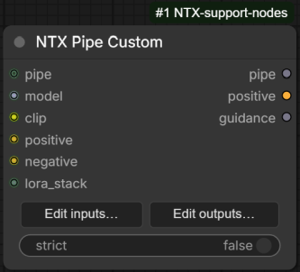
A "pipe" node used to bundle many values into a single wire. The pipe itself is a dictionary
(DICT type): every connected input is stored in the dictionary under the input's name, and
every output reads the value with the same name back out of the dictionary. The set of custom
inputs and outputs is defined per-node by the user through an editor dialog, and inputs and
outputs are configured independently — a node may, for example, only add values to the pipe
(inputs only) or only extract them (outputs only).
Inputs
| Input | Type | Description |
|---|---|---|
| pipe | DICT (optional) | An upstream pipe to extend. If omitted, a new empty pipe is created. The input pipe is cloned, so downstream changes never affect the upstream dictionary. |
| inputs_data | STRING (hidden) | JSON produced by the editor dialog describing the configured inputs/outputs ({"inputs": [...], "outputs": [...]}). Managed entirely by the frontend; not edited by hand. |
| strict | BOOLEAN | When enabled, a warning toast (and log entry) lists every configured output whose name is not found in the pipe — typically a typo between an upstream input and this output. The per-type default is returned either way; execution is not interrupted. Default false. |
| custom inputs | user-defined | One slot per configured input, with the chosen name and type. Only connected (non-None) values are written into the pipe. |
Outputs
| Output | Type | Description |
|---|---|---|
| pipe | DICT | The merged pipe dictionary (input pipe + values from the connected custom inputs). |
| custom outputs | user-defined | One slot per configured output; each returns pipe[name]. If the name is not present in the pipe, a per-type default is returned (0 for INT, 0.0 for FLOAT, "" for STRING, False for BOOLEAN, [] for LORA_STACK / CONTROL_NET_STACK / LIST, {} for DICT, None otherwise). |
Up to 30 custom inputs and 30 custom outputs per node. The names pipe, inputs_data and
strict are reserved and cannot be used for custom entries.
Frontend
The node body shows two buttons, Edit inputs… and Edit outputs…, which open the editor dialog for the corresponding side. In the dialog:
- + Add appends a new entry; each row has a name field and a type dropdown
(IMAGE, MASK, LATENT, MODEL, CLIP, VAE, CONDITIONING, INT, FLOAT, STRING, BOOLEAN,
LORA_STACK, CONTROL_NET_STACK, DICT, LIST,
*). - The name field offers autocompletion: suggested names are the entries configured on the other side of the node, plus every key written into the pipe by the PipeCustom nodes found upstream (the graph is walked breadth-first through all DICT-typed inputs — so PipeMerge branches and pipe-passing nodes are traversed — up to 100 nodes). Picking a suggested name also presets the row's type to the type known for that key; it can still be changed manually.
- Rows can be drag-reordered with the handle and removed with ✕.
- Renaming a row keeps its slot and any connected wires — only removing a row (or changing its type) drops the wire. A rename is also propagated to the entry with the same name on the other side (inputs ↔ outputs), so the pipe key keeps matching end to end; an info toast lists the propagated renames. Propagation is skipped if the new name is already taken on that side.
- Copy from inputs/outputs replaces the list with the entries of the other side.
- Load template… opens a picker with predefined property sets loaded from
input/ntx_data/custom_pipe_presets.yaml; the chosen template's properties are appended, skipping names already present. Ticking Replace current entries in the picker clears the list before the template is applied instead of appending to it (nothing is committed until the editor dialog is confirmed with OK). - Save as template… stores the current list as a named template in the same file, so it can be reloaded later on any PipeCustom node. If the name is already taken, the button changes to Overwrite and a second click is required to replace the existing template.
- Names are validated on OK (non-empty, no duplicates, no reserved names). If a name exists on both sides with different types, a warning toast is shown.
- Enter (while editing a name) confirms, Escape cancels.
Templates are stored in input/ntx_data/custom_pipe_presets.yaml: one entry per template, the
key being the name shown in the picker and its mapping holding the properties in order, as
name: type pairs. A missing (empty) type, or the quoted '*' wildcard, means any type:
Image:
    width: INT
    height: INT
    latent: LATENT
    model_name: '*'
The file is re-read every time the picker is opened, so it can be hand-edited while ComfyUI is running; an entry that is not a mapping of properties is skipped with a warning in the log. Saving rewrites the whole file with the four standard comment lines at the top — any other comment it contained is dropped — and refuses to write if the file exists but cannot be parsed, rather than replacing what it failed to read.
Right-click menu options on the node:
- Edit pipe inputs… / Edit pipe outputs… — same as the two buttons.
- Split custom pipe — creates a second PipeCustom node to the right, moves all custom
outputs (and their outgoing links) onto it, connects the original's
pipeoutput to the new node'spipeinput, and shifts the downstream nodes/groups to make room. The original node keeps only its inputs. - Merge custom pipes — the reverse: merges the right-clicked node back into the upstream PipeCustom it is connected to (the source takes over the target's outputs and outgoing links, the target is deleted and downstream nodes are shifted back). Requires the target to have no non-pipe inputs connected and the source no non-pipe outputs connected.
Right-click menu option on the canvas (only shown while the selection contains at least one PipeCustom node):
- Merge all selected custom pipe nodes — runs Merge custom pipes on every selected PipeCustom node in a single pass. Nodes that do not meet the merge requirements above are skipped silently (no per-node warnings); a final toast reports how many of the selected nodes were merged. In a selected chain of three or more pipes a node skipped only because its source still had connected outputs can be picked up by running the command again.
LoraStack
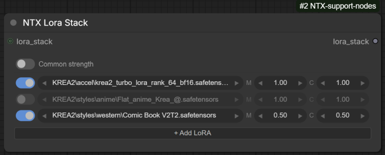
Builds a LORA_STACK from a list of LoRAs configured directly on the node through a custom widget (no model is loaded here — combine with ApplyLoraStack to actually apply the stack).
Inputs
| Input | Type | Description |
|---|---|---|
| loras_data | STRING (hidden) | JSON serialisation of the widget state ({"commonStrength": bool, "loras": [{enabled, name, modelStrength, clipStrength}, ...]}). Managed by the frontend widget. A bare JSON array (the old format) is still accepted. |
| lora_stack | LORA_STACK (optional) | An upstream stack to extend; the configured LoRAs are appended to it. |
Outputs
| Output | Type | Description |
|---|---|---|
| lora_stack | LORA_STACK | The input stack (if any) plus one entry per enabled row with a real LoRA selected (rows set to none are skipped). When Common strength is on, the model strength is also used as the clip strength. |
Frontend
The loras_data widget is replaced by a custom LoRA list UI:
- Common strength toggle in the header: when on, the clip strength column is hidden and the model strength is used for both.
- Each row: a drag handle (⠿, drag to reorder), an on/off toggle, the LoRA name, and M (model) / C (clip) strength widgets. The strength pills step ±0.05 with the ◀ ▶ arrows (CTRL+click for ±0.01) and scrub on horizontal drag (CTRL for fine steps); a plain click on the value opens an input box to type it directly (Enter or clicking away confirms, Escape cancels).
- Clicking the LoRA name opens a flat dropdown with a live filter box; the ◀ ▶ arrows next to the name step to the previous/next LoRA in the list.
- The 📂 button (or Shift+click on the LoRA name) opens a tree selector organised by
subfolder, with a search box, Refresh button (re-scans the loras folder on disk via the
reload_loras_listbackend route), OK/Cancel, double-click to confirm, and Enter/Escape keys. - Rows referencing a file that is missing from the loras folder get a red outline; rows that duplicate an earlier entry (which ApplyLoraStack would skip) get an amber outline. The tooltip on the name explains the warning.
- + Add LoRA appends a row; right-click on a row offers Delete, Move up, Move down plus the stack-level actions; right-click elsewhere on the widget (header, add button) opens the stack-level menu directly: Enable all, Disable all, Remove disabled, Copy stack as text and Paste from text.
- Copy stack as text puts the enabled rows on the clipboard in
<lora:name:model[:clip]>format (one per line); Paste from text parses any text containing such tags and appends the entries, matching names against the known list (a missing extension defaults to.safetensors, and bare basenames are resolved against subfolders).
Right-click menu options on the node:
- Rebuild LoraStack UI — recreates the custom widget in place (recovery for the rare case where the node deserialises with the raw-JSON fallback widget).
- Reload Lora List from disk — re-scans the loras folder on the backend and rebuilds the widget so the fresh list is available immediately.
MergeLoraStacks
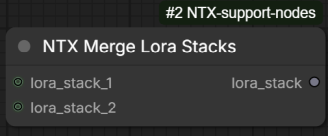
Concatenates two LORA_STACKs into one.
Inputs
| Input | Type | Description |
|---|---|---|
| lora_stack_1 | LORA_STACK (optional) | First stack; its entries come first in the result. |
| lora_stack_2 | LORA_STACK (optional) | Second stack; appended after the first. |
Outputs
| Output | Type | Description |
|---|---|---|
| lora_stack | LORA_STACK | All entries of stack 1 followed by all entries of stack 2. Missing inputs are treated as empty. |
ApplyLoraStack
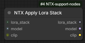
Applies every LoRA in a stack to a model (and optionally a CLIP), with duplicate detection, an in-memory file cache, and optional download of missing files from cloud storage.
For each (name, strength_model, strength_clip) entry:
- entries with both strengths equal to 0 are skipped;
- a LoRA already applied earlier in the stack (same name) is skipped;
- the file is resolved in the
lorasmodel folder. If it is missing and cloud download is enabled inconfig.yaml(download_missing_loras,cloud_storage_id; active on Linux only), the node attempts to fetch it; otherwise a warning toast is emitted and the entry is skipped; - the LoRA weights are loaded from disk and kept in a cache shared by all ApplyLoraStack nodes
(size limited by
cache.max_lorasinconfig.yaml, default 5, oldest evicted first), then applied withcomfy.sd.load_lora_for_models.
Inputs
| Input | Type | Description |
|---|---|---|
| lora_stack | LORA_STACK | The stack to apply. An empty or missing stack passes model/clip through unchanged. |
| model | MODEL | The model to patch. |
| clip | CLIP (optional) | The CLIP to patch. If omitted, only the model is patched. |
Outputs
| Output | Type | Description |
|---|---|---|
| lora_stack | LORA_STACK | The stack of LoRAs actually applied (skipped/failed entries removed) — useful for logging or converting to a string. |
| model | MODEL | The patched model. |
| clip | CLIP | The patched CLIP (or the input value if none was provided). |
ConvertLoraStackToString
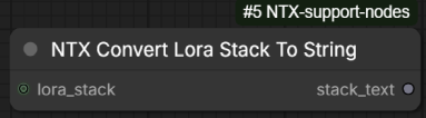
Formats a LORA_STACK as text, one LoRA per line, in the <lora:name:model_strength:clip_strength>
syntax (strengths rounded to 2 decimals). Entries missing a strength default to the model
strength, or to 1.0 when only the name is present.
Inputs
| Input | Type | Description |
|---|---|---|
| lora_stack | LORA_STACK (optional) | The stack to format. Empty/missing produces an empty string. |
Outputs
| Output | Type | Description |
|---|---|---|
| stack_text | STRING | One <lora:...> line per entry. |
ConvertLoraStringToStack
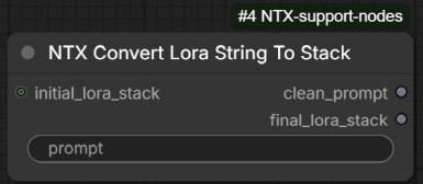
The reverse operation: parses <lora:name:strength[:clip_strength]> references out of a text
prompt and turns them into a LORA_STACK, returning the prompt cleaned of the tags.
- If the optional
:clip_strengthpart is missing, the model strength is used for both. - A LoRA name without extension gets
.safetensorsappended; path separators are normalised. - The cleaned prompt has all
<...>angle-bracket sections removed (not only LoRA tags), with leftover runs of spaces collapsed (newlines preserved).
Inputs
| Input | Type | Description |
|---|---|---|
| prompt | STRING | The text to parse. |
| initial_lora_stack | LORA_STACK (optional) | A stack to prepend; the parsed entries are appended to it. |
Outputs
| Output | Type | Description |
|---|---|---|
| clean_prompt | STRING | The prompt with the angle-bracket sections removed. |
| final_lora_stack | LORA_STACK | initial_lora_stack + the entries parsed from the prompt. |
ModelInfo
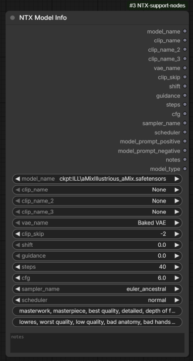
A "settings sheet" for a model: it groups the model selection and its recommended generation
parameters in one node and simply passes every value through to its outputs, so they can be
wired to loaders, samplers, etc. The values can be loaded from / saved to a .ntxdata
sidecar file stored next to the model file (see Frontend below).
The model_name combo lists both checkpoints and diffusion models, prefixed with the model
kind: ckpt:<name> for models/checkpoints, diff:<name> for models/diffusion_models.
On execution the prefix is stripped: the bare name is emitted on model_name and the resolved
folder type (checkpoints / diffusion_models) on model_type.
Inputs
| Input | Type | Description |
|---|---|---|
| model_name | COMBO | The model, prefixed with ckpt: or diff:. |
| clip_name, clip_name_2, clip_name_3 | COMBO | Up to three text encoders (None = unused). |
| vae_name | COMBO | VAE to use, or Baked VAE for the one embedded in the checkpoint. |
| clip_skip | INT | CLIP skip (≤ 0, default -1). |
| shift | FLOAT | Sampling shift (model-dependent). |
| guidance | FLOAT | Guidance value (e.g. Flux). |
| steps | INT | Recommended step count. |
| cfg | FLOAT | Recommended CFG scale. |
| sampler_name, scheduler | COMBO | Recommended sampler / scheduler. |
| model_prompt_positive, model_prompt_negative | STRING | Prompt snippets associated with the model (e.g. trigger words, quality tags). |
| notes | STRING (multiline) | Free-form notes about the model. |
Outputs
Every input is repeated as an output with the same name (combos are emitted as wildcard type so they can connect to any matching input), plus:
| Output | Type | Description |
|---|---|---|
| model_type | STRING | The folder type decoded from the prefix: checkpoints or diffusion_models. |
Frontend
Right-click menu options on the node:
- Load Model Info — asks the backend for the data stored in the model's
.ntxdatasidecar file and fills the node's widgets with it. Fields missing from the file are left unchanged and listed in a warning toast. - Save Model Info — sends the current widget values to the backend, which writes them
into the sidecar data. Note: the file is written with a
.ntxdata_newextension (next to the model), so the existing.ntxdatais never overwritten directly.
LoadPrompt
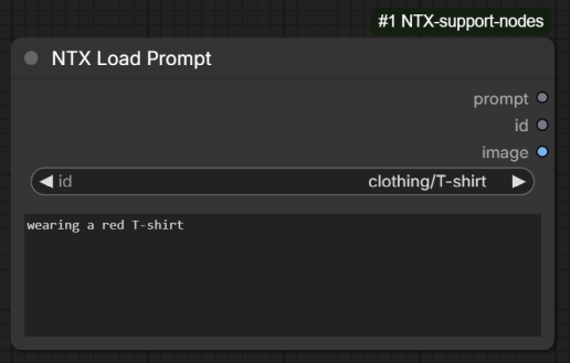
Picks a prompt from a nested, file-based prompt library and outputs its text (plus an optional
preview image). The library lives in input/ntx_data/prompts/ and is merged from two sources:
- every
*.yaml/*.ymlfile in the top level of that folder: dictionary keys become nested category paths and list items become the selectable leaves. A leaf is either a plain string (used as both id and prompt text, or split asid::text), or a dictionary withname(the id) andpositive(the prompt) keys — any extra keys become named parameters used by the LoadPromptAdvanced variant; - every
*.txtfile inside subdirectories of the folder: the relative path without extension becomes the id (e.g.scenes/fantasy/castle.txt→scenes/fantasy/castle) and the file content the prompt.
For example, this YAML file shows the three leaf forms:
scenes:
  fantasy:
    - a misty castle on a cliff at dawn
    - dungeon::a torch-lit stone dungeon, dripping water, volumetric light
  sci-fi:
    - name: space station
      positive: interior of a vast orbital space station, earth visible through the windows
| Id | Prompt text |
|---|---|
| scenes/fantasy/a misty castle on a cliff at dawn | the id itself (plain string leaf) |
| scenes/fantasy/dungeon | a torch-lit stone dungeon, dripping water, volumetric light (id::text leaf) |
| scenes/sci-fi/space station | interior of a vast orbital space station, earth visible through the windows (dictionary leaf) |
The library is cached in memory on the backend, and the option list of the id combo is
re-read from the files on disk every time the node definitions are fetched — on page load and
when they are reloaded with R (Refresh Node Definitions) — so prompts added on disk show
up without a backend restart. The tree picker's Refresh button and the right-click reload
entry (see Frontend) also update the dropdown of every LoadPrompt* node immediately. Any id
value is accepted at execution time, so a workflow saved with an id that was later removed
from the library still runs (the prompt box keeps its saved text).
Inputs
| Input | Type | Description |
|---|---|---|
| id | COMBO | The prompt id (category/.../name). The option list mirrors the library on disk (see above). |
| prompt | STRING (multiline) | The prompt text. The frontend fills it automatically when an id is selected, and it can be freely edited afterwards. If left empty (e.g. headless/API execution), the library text for the id is used. |
Outputs
| Output | Type | Description |
|---|---|---|
| prompt | STRING | The prompt text (edited value, or the library text if the box was empty). |
| id | STRING | The selected id. |
| image | IMAGE | The preview image stored next to the prompt id (same path with a .png / .jpeg / .jpg extension), or nothing if no such file exists. |
Frontend
- Shift+click on the
idwidget opens a tree picker organised by category, with a filter box, OK/Cancel, double-click to confirm, and Enter/Escape keys. Its Refresh button makes the backend re-read the prompt files from disk, rebuilds the tree and updates theiddropdown of every LoadPrompt* node in the graph. - The tree picker shows a preview pane below the tree: the library text of the highlighted prompt, together with its thumbnail when an image sits next to the prompt file.
- Selecting an id (from the picker or the combo) automatically fills the
prompttextbox with the library text. If the current text was edited manually (it differs from the library text of the previously selected id), a confirmation dialog asks before replacing it — cancelling keeps the edited text while still switching the id.
Right-click menu options on the node:
- Rebuild Prompts List from disk — same effect as the tree picker's Refresh button:
the backend re-reads the prompt files, the cached maps are refreshed and the
iddropdowns are updated. - Pick prompt — opens the same tree picker (filter, preview pane, double-click to confirm) purely to copy a prompt's library text to the clipboard; nothing on the node is changed. Unlike the other entry, this one is added to the right-click menu of every node and of the empty canvas, not just LoadPrompt* nodes, so a prompt can be grabbed from anywhere in the graph. When invoked on a LoadPrompt* node the picker starts on that node's current id; elsewhere (another node or the empty canvas) it reopens on the last prompt picked this way, so the previous selection is remembered across calls (until the page is reloaded). A toast confirms the copy (and a hidden-textarea fallback is used when the browser clipboard API is unavailable, e.g. over plain HTTP).
The same frontend behaviour (tree picker, prompt auto-fill, RMB reload) is shared by the LoadPromptAdvanced and LoadPromptChar variants described below.
LoadPromptAdvanced
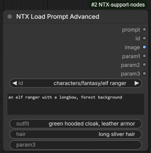
Same as LoadPrompt, with three extra free-form string parameters that are passed straight through to the outputs, plus a dictionary output carrying all the extra keys of the entry.
Differences from LoadPrompt:
- three additional STRING inputs,
param1,param2,param3, each repeated unchanged as an output with the same name; - an additional
paramsDICT output with every extra key:value pair of the selected library entry (empty for plain-string leaves) — useful downstream with ParametricText or ParametricFileName, and not limited to three values or to widget renaming; - when the selected library entry is a dictionary carrying extra keys besides
nameandpositive, the frontend fills the param widgets from those keys when the id is selected. A widget is matched by its current (user-facing) name, so renaming e.g.param2tooutfiton the node makes it pick up the entry'soutfitvalue. Params the entry does not define are cleared.
Example
A YAML file in the prompt library:
characters:
  fantasy:
    - name: elf ranger
      positive: an elf ranger with a longbow, forest background
      outfit: green hooded cloak, leather armor
      hair: long silver hair
This defines the id characters/fantasy/elf ranger, whose prompt is the positive text and
whose extra parameters are outfit and hair. On a LoadPromptAdvanced node where param1
has been renamed to outfit and param2 to hair, selecting that id fills the widgets as:
| Widget | Value after selection |
|---|---|
| prompt | an elf ranger with a longbow, forest background |
| outfit (renamed param1) | green hooded cloak, leather armor |
| hair (renamed param2) | long silver hair |
| param3 | cleared (the entry does not define a param3 key) |
LoadPromptChar
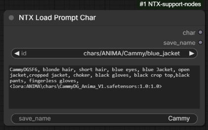
Same as LoadPrompt, specialised for character prompts to be saved/reused by name.
Differences from LoadPrompt:
- an additional STRING input
save_name, passed through unchanged to thesave_nameoutput (like the params of LoadPromptAdvanced, its widget is filled from the library entry's extra keys when an id is selected); - the prompt text is emitted on an output named
charinstead ofprompt; - there are no
idandimageoutputs — the node outputs onlycharandsave_name.
LazySelectAny
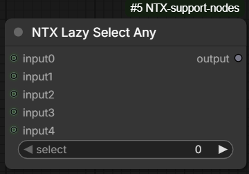
A branch selector with lazy evaluation: it returns the value of one of its five wildcard
inputs, chosen by index — and only the selected branch of the graph is executed. The node uses
ComfyUI's lazy-input mechanism (check_lazy_status) to request the evaluation of just the
selected input, so the upstream nodes feeding the unselected inputs are never run. This makes
it useful as a switch between alternative (possibly expensive) sub-graphs, e.g. two different
image-processing chains.
Inputs
| Input | Type | Description |
|---|---|---|
| select | INT | Index of the input to return (0–4). |
| input0 … input4 | any (optional, lazy) | The selectable values. All five slots accept any data type; only the one addressed by select is evaluated. |
Outputs
| Output | Type | Description |
|---|---|---|
| output | any | The value of the selected input (None if that slot is not connected). |
PreviewAsText
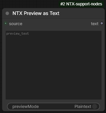
Shows any value as text on the node, like the core Preview as Text node — but it is not
an output node, so placing it in a workflow never triggers an execution by itself. The node
only runs when a downstream node actually consumes its text output; wire the value through
it rather than dead-ending into it (or use the right-click queue entry below to run it on
demand). The preview refreshes whenever the node executes.
The value is converted to text as follows: strings are shown as-is; ints, floats and booleans
via str(); anything else is serialised as indented JSON, falling back to str() (tensors are
printed with 6 edge items per dimension), and finally to a
source exists, but could not be serialized. message. A missing value shows None.
Inputs
| Input | Type | Description |
|---|---|---|
| source | any | The value to preview. |
Outputs
| Output | Type | Description |
|---|---|---|
| text | STRING | The text representation of source, as shown in the preview. |
Frontend
- The node body shows a read-only Preview area, filled with the text when the node executes.
- A Markdown / Plaintext toggle switches the preview between a rendered-markdown view and a plain textarea (default: Plaintext). The toggle and the preview content are display-only and are not saved into the workflow or the API prompt.
Right-click menu option on the node:
- Queue (this node as output) — queues the current workflow with this node as the only execution target, as if it were an output node: exactly its branch runs (upstream dependencies included), and every other output node in the workflow is skipped. The saved workflow is not modified. Muted/bypassed nodes and nodes inside subgraphs cannot be queued this way (a warning toast is shown). Note: a run forced this way is cached separately from a normal run, so the node re-executes the first time it is reached through the regular queue afterwards.
PreviewImage
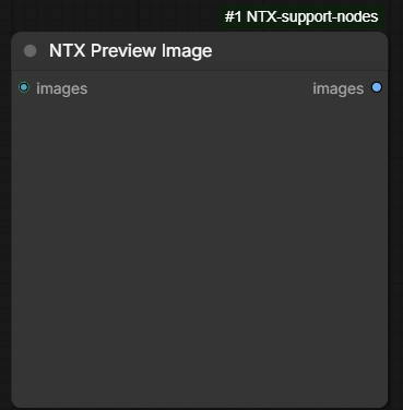
Shows image previews on the node, like the core Preview Image node — but, as with
PreviewAsText, it is not an output node: it never triggers an execution by itself and
only runs when a downstream node consumes its images output. Unlike the core node it
therefore has a pass-through output, so it can sit in the middle of an image chain and
preview whatever flows through.
The previews are written to ComfyUI's temporary folder (one PNG per image in the batch, low
compression) and embed the prompt/workflow metadata, exactly like the core node (metadata is
omitted when ComfyUI runs with --disable-metadata).
Inputs
| Input | Type | Description |
|---|---|---|
| images | IMAGE | The image batch to preview. |
Outputs
| Output | Type | Description |
|---|---|---|
| images | IMAGE | The input batch, passed through unchanged. |
Frontend
Right-click menu option on the node:
- Queue (this node as output) — same behaviour as on PreviewAsText: queues the workflow with just this node's branch as the execution target.
Reroute nodes
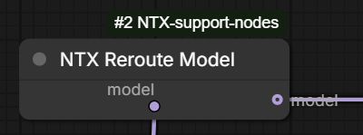
A family of pass-through nodes (under reroute in the node menu), one per data type, used to organise the wires of a workflow. Each node has a single input and a single output and forwards whatever it receives, unchanged. The input is optional: when it is left disconnected the node outputs a type-appropriate default value instead, so a reroute can also serve as a source of an "empty" value.
Available variants (slot name — default output when the input is disconnected):
- RerouteAny —
value, accepts any type (None) - RerouteBoolean —
boolean(False) - RerouteFloat —
float(0.0) - RerouteInteger —
integer(0) - RerouteString —
string("") - RerouteModel —
model(None) - RerouteClip —
clip(None) - RerouteClipVision —
clip_vision(None) - RerouteVae —
vae(None) - RerouteImage —
image(None) - RerouteMask —
mask(None) - RerouteLatent —
latent(None) - RerouteConditioning —
conditioning(None) - RerouteDict —
dict({}) - RerouteList —
list([]) - RerouteLoraStack —
lora_stack([]) - RerouteControlNetStack —
control_net_stack([])
The primitive variants (boolean, float, integer, string) only accept a link — they
never show an editable widget.
Inputs
| Input | Type | Description | |---|---|---| | (slot name from the list above) | matches the variant (optional) | The value to pass through. |
Outputs
| Output | Type | Description | |---|---|---| | (slot name from the list above) | matches the variant | The input value, unchanged; the variant's default when the input is disconnected. |
Frontend
Repositionable slots. By default the input sits on the left edge and the output on the
right edge, but each of them can be moved to any of the four sides of the node — with the
constraint that the input and the output never share a side. Wires bend accordingly, leaving
or entering the node in the direction of the side their slot sits on, and the slots keep
their side when the node is resized. The chosen layout is saved with the workflow (in the
node properties input_side / output_side); picking Left to Right returns the node to
the standard layout. A collapsed node uses the usual collapsed connection points until it is
expanded again.
Free resizing. Reroute nodes can be resized down to 80 px wide (standard nodes stop at about 140 px), so they can be kept compact. Two side effects of shrinking below the text width: the title and slot labels may visually overflow the node (renaming the node to something short avoids it), and the native Resize right-click action snaps the node straight to the minimal width.
Right-click menu option on the node:
- Slot sides — submenu listing every valid input→output side combination (Left to Right, Left to Top, …, 12 in total; same-side combinations are not offered). The current layout is marked with a ✓; clicking an entry applies both sides at once.
GlobalSet
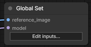
One half of a wireless connection pair (found under reroute, together with GlobalGet): it stores any number of connections under unique names, and GlobalGet nodes read them back anywhere on the canvas — subgraphs included — without a cable. The set of inputs is defined per node through an editor dialog (same style as the PipeCustom editor), each entry with its own name and data type.
Both nodes are virtual: they exist only in the editor and are removed from the prompt when the workflow is queued — every GlobalGet output resolves directly to the node feeding the same-named GlobalSet input, so the pair never executes, adds no cost and cannot change the result. Muting or bypassing them has no effect on a run for the same reason.
Names are global: a name may be defined by only one GlobalSet in the whole workflow
(nested subgraphs included) — the editor rejects a name already defined by another GlobalSet,
and a pasted or cloned GlobalSet automatically renames its conflicting entries
(foo → foo_2, foo_3, …).
Inputs
| Input | Type | Description | |---|---|---| | custom inputs | user-defined | One slot per configured entry, with the chosen name and type. Whatever is wired in is readable under that name by every GlobalGet. A slot left unconnected stores nothing — GlobalGet outputs with that name resolve to no value (the downstream input behaves as unconnected). |
Outputs
The node has no outputs — values are read back with GlobalGet nodes.
Up to 30 entries per node.
Frontend
The node body shows an Edit inputs… button opening the editor dialog:
- + Add input appends a new entry; each row has a name field and a type dropdown (same
type list as the PipeCustom editor: IMAGE, MASK, LATENT, MODEL, CLIP, VAE, CONDITIONING,
INT, FLOAT, STRING, BOOLEAN, LORA_STACK, CONTROL_NET_STACK, DICT, LIST,
*). - Rows can be drag-reordered with the handle and removed with ✕.
- Renaming a row keeps its slot and wire; changing a row's type keeps the slot but drops the wire. Names are validated on OK: non-empty, no duplicates on the node, not defined by another GlobalSet.
- Changes are propagated to the GlobalGet nodes on OK: a renamed entry renames the matching Get outputs everywhere (their slots and wires are kept), a type change retypes them (their wires are dropped, as they are no longer valid), and a removed entry leaves the Get outputs in place but a warning toast lists the orphaned names.
- Enter (while editing a name) confirms, Escape cancels.
Right-click menu options on the node:
- Edit global inputs… — same as the button.
- Select its Get nodes (n) — selects every GlobalGet in the same graph that reads at least one of this node's names.
GlobalGet
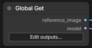
The other half of the pair: exposes values stored by GlobalSet nodes as outputs, with no cable. The set of outputs is defined through the same editor dialog — but only names defined by a GlobalSet can be used, and each output automatically takes the defining entry's data type. Any number of GlobalGet nodes may read the same name, so one value can fan out across the whole workflow, including into or out of subgraphs.
Like GlobalSet, the node is virtual (see above): at queue time each output resolves straight to the real node feeding the same-named GlobalSet input. An output whose name is no longer defined, or whose GlobalSet slot is unconnected, resolves to no value — a downstream node with that required input then fails prompt validation, exactly as if the input were unconnected.
Inputs
The node has no inputs — values are stored with GlobalSet nodes.
Outputs
| Output | Type | Description | |---|---|---| | custom outputs | taken from the Set | One slot per configured entry; carries the value wired into the same-named GlobalSet input, with that entry's type. |
Up to 30 entries per node.
Frontend
The node body shows an Edit outputs… button opening the editor dialog:
- Rows work as on GlobalSet (add, drag-reorder, remove, rename keeps the wires), with two differences: the name field autocompletes with the names defined by the GlobalSet nodes, and the type dropdown is locked to the defining entry's type as soon as the name is recognised.
- Add all Set names appends one entry for every defined name not already on the node.
- Names are validated on OK: non-empty, no duplicates on the node, and every name must be defined by a GlobalSet.
- Renames made on the GlobalSet side follow automatically (see GlobalSet above); an entry whose name was removed on the Set side stays on the node (with its warning toast) until it is fixed or removed here.
Right-click menu options on the node:
- Edit global outputs… — same as the button.
- Jump to Global Set — submenu with one entry per output name; centers the view on the GlobalSet defining that name, switching into its graph when it lives in a different subgraph.
DoublePrompt
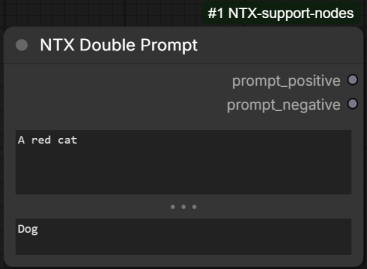
A positive/negative prompt pair in a single node: two multiline text fields whose contents are output unchanged. Its distinguishing feature is that the boundary between the two fields can be dragged, so the node's height can be shared freely between the positive and the negative prompt (a long positive prompt next to a one-line negative, for instance).
Inputs
| Input | Type | Description |
|---|---|---|
| prompt_positive | STRING (multiline) | The positive prompt. Dynamic prompts syntax is enabled. |
| prompt_negative | STRING (multiline) | The negative prompt. Dynamic prompts syntax is enabled. |
Outputs
| Output | Type | Description |
|---|---|---|
| prompt_positive | STRING | The positive prompt, exactly as typed. |
| prompt_negative | STRING | The negative prompt, exactly as typed. |
Frontend
- A divider sits in the gap between the two fields, marked with three grip dots (the mouse cursor turns into a vertical resize arrow over it). Dragging it moves the boundary: enlarging the positive field shrinks the negative one by the same amount, and vice versa. Each field always keeps a minimum height of 50 px.
- Double-click on the divider restores the even 50/50 split.
- The split is stored as a proportion of the node body (node property
split_ratio, saved with the workflow), so resizing the node itself keeps the chosen balance between the two fields.
ResizeImageMask
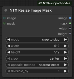
Resizes an image and/or a mask with a selectable strategy: pass-through, crop to a target
size, pad to a target size, several aspect-preserving scales, or matching the size of another
input. The mode widget is a dynamic combo: selecting a mode shows only the widgets (and, for
the match modes, the extra input slot) that the mode actually uses.
Both image and mask are optional and are processed together with the same target size, so
they stay aligned. If both are connected they must have the exact same size (batch size,
width and height) — otherwise the node raises an error. Whichever of the two is missing is
simply skipped and its output is empty.
Every mode except do nothing rounds the final width and height with divisible_by (e.g.
with divisible_by = 16, both sides of the result are multiples of 16). Where a mode
computes a side from the aspect ratio, the rounding may make the final aspect ratio deviate
slightly from the source.
upscale_method defaults to auto, which picks the interpolation per input instead of
applying the same one to everything: a mask is always rescaled with bilinear, an
image with lanczos when it grows and area when it shrinks (the sharpest filter when
enlarging, a proper box average — no aliasing or moiré — when reducing). The image and the
mask are resolved independently, so with both connected the same run can use lanczos on the
image and bilinear on the mask. The direction is decided on the total pixel count, so a
resize that grows one side and shrinks the other follows the dominant one; in the crop modes
it is measured after the crop, and in the pad modes on the scaled content rather than on the
padded canvas. Since bilinear produces soft edges, pick nearest-exact explicitly when a
mask must stay strictly binary. Any method other than auto is applied as chosen to both
inputs.
Inputs
| Input | Type | Description |
|---|---|---|
| image | IMAGE (optional) | The image to resize. |
| mask | MASK (optional) | The mask to resize. |
| mode | dynamic COMBO | The resize strategy; see the mode list below. Default do nothing. |
| upscale_method | COMBO | Interpolation used for every rescale: auto (default), nearest-exact, bilinear, area, bicubic, lanczos. auto picks the filter per input, see above. |
| divisible_by | INT | The final width and height are rounded to the nearest multiple of this value (1–1024, default 1 = no rounding). Ignored by do nothing. |
Modes
do nothing— passesimageandmaskthrough unchanged (divisible_byincluded: no rounding is applied).round— the size is rounded withdivisible_by.crop to size— widgetswidth,height(1–16384, default 512) andcrop(center,top,bottom,left,right). The input is rescaled to fill the target size completely and the excess is cropped away;croppicks which part is kept — e.g.topkeeps the top of a too-tall result. When the excess falls on the axis the position does not address (e.g.topwith excess on the sides), the crop is centered.pad to size— widgetswidth,height,pad(center,top,bottom,left,right) andpad_color(color picker, default black). The input is rescaled to fit entirely inside the target size and the leftover area is filled withpad_color;padpicks where the content sits — e.g.topanchors it to the top edge, putting all the padding at the bottom. Padding on the axis the position does not address is split evenly. The mask is always padded with 0 (pad_coloronly affects the image).scale by multiplier— widgetmultiplier(FLOAT 0.01–16.0, default 1.0). Both sides are multiplied by the value, then rounded withdivisible_by.scale longer dimension/scale shorter dimension— widgetlonger_side/shorter_side(1–16384, default 1024). The longer (resp. shorter) side of the input is scaled to the given value and the other side follows the aspect ratio. The chosen side is rounded withdivisible_bybefore computing the scale, so it always lands exactly on the requested multiple; the other side is rounded after.scale width/scale height— widgetwidth/height(1–16384, default 1024). Same as above, but the anchored side is explicitly the width (resp. the height).scale total pixels— widgetmegapixels(FLOAT 0.01–256.0, default 1.0; 1 megapixel = 1024×1024 pixels). Both sides are scaled by the same factor so that the total pixel count matches the requested megapixels, then rounded withdivisible_by— because the rounding happens after the match, the final pixel count is close to, not exactly on, the target.crop to match input/pad to match input— same behaviour ascrop to size/pad to size(including thecrop/pad+pad_colorwidgets), but the target width and height are taken from an extramatchinput slot, which accepts an IMAGE or a MASK and is required while one of these modes is selected. The match size is still rounded withdivisible_by, so leave it at1when the output must match the reference exactly.
Outputs
| Output | Type | Description |
|---|---|---|
| image | IMAGE | The resized (or passed-through) image; empty when image is not connected. |
| mask | MASK | The resized (or passed-through) mask; empty when mask is not connected. |
| width | INT | The final width, measured on the output image (or the output mask when no image is connected; 0 when neither is). |
| height | INT | The final height, measured the same way. |
ImageResolution
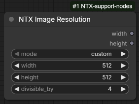
Outputs a width / height pair, computed with a selectable strategy: entered directly,
picked from the size presets, derived from an aspect ratio and/or a pixel budget, or copied
from an existing image or mask. The mode widget is a dynamic combo: selecting a mode shows
only the widgets (and, for match image and resize image, the extra input slot) that the mode actually uses.
Whatever the mode, the resulting width and height are rounded with divisible_by (nearest
multiple, never below the divisor). Where a mode computes a side from an aspect ratio or a
pixel count, this rounding may make the result deviate slightly from the exact target.
The preset and aspect ratio lists are read from image_presets.yaml in the addon's data folder.
Inputs
| Input | Type | Description |
|---|---|---|
| mode | dynamic COMBO | How the resolution is produced; see the mode list below. Default custom. |
| divisible_by | INT | The width and height are rounded to the nearest multiple of this value (1–1024, default 8; 1 = no rounding). |
Modes
custom— widgetswidthandheight(1–16384, default 512). The values are used as-is (then rounded withdivisible_by).preset— widgetimage_size, a combo of the preset sizes (e.g.832x1216); the width and height are extracted from the selected entry.resolution— widgetsaspect_ratio(a combo of the aspect ratio presets, e.g.3:2 (Photo)) andmegapixel(FLOAT 0.01–256.0, default 1.0; 1 megapixel = 1024×1024 pixels). The size is computed so that the total pixel count matches the requested megapixels while keeping the chosen aspect ratio.resolution and width— widgetswidth(1–16384, default 1024) andmegapixel. The width is fixed and the height is computed to reach the requested pixel count.resolution and height— widgetsheight(1–16384, default 1024) andmegapixel. The mirror of the above: the height is fixed and the width is computed.match image— an extramatchinput slot, which accepts an IMAGE or a MASK and is required while this mode is selected. The width and height are read from that input. The size is still rounded withdivisible_by, so set it to1when the output must match the reference exactly.resize image by factor— an extramatchinput slot (IMAGE or MASK, required while this mode is selected) and amultiplierwidget (FLOAT 0.01–16.0, default 1.0). The width and height are read frommatchand multiplied bymultiplier(then rounded withdivisible_by).resize image to resolution— an extramatchinput slot (IMAGE or MASK, required while this mode is selected) and amegapixelwidget (FLOAT 0.01–256.0, default 1.0). The width and height are read frommatchand the size is computed so that the total pixel count matches the requested megapixels while keeping the original aspect ratio.
Outputs
| Output | Type | Description |
|---|---|---|
| width | INT | The computed width, rounded with divisible_by. |
| height | INT | The computed height, rounded with divisible_by. |
MaskOverlay
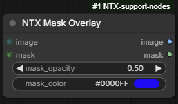
Previews a mask overlaid on an image as a colored, semi-transparent layer — useful for
checking segmentation or inpainting masks against the picture they belong to. The composited
preview is shown on the node (it is an output node, so it runs as soon as it is reached)
and is also emitted on the image output for further processing.
Both inputs are optional, and the preview adapts to what is connected:
- image + mask — the mask area is tinted with
mask_coloratmask_opacitystrength (the blend weight ismask × mask_opacity, so soft mask edges fade smoothly). A mask whose size differs from the image is rescaled (bilinear) to fit for the blend only — themaskoutput keeps the original resolution; - image only — the image is shown unchanged;
- mask only — the mask is shown as a grayscale image;
- nothing connected — a 64×64 black placeholder.
An RGBA input image is converted to RGB (the alpha channel is dropped).
Inputs
| Input | Type | Description |
|---|---|---|
| mask_opacity | FLOAT | Opacity of the color overlay (0.0–1.0, step 0.01, default 0.5). 0 shows the image untouched, 1 paints the masked area with the solid color. |
| mask_color | COLOR | Color of the overlay (color picker, default #0000FF). |
| image | IMAGE (optional) | The image to overlay onto (RGBA is converted to RGB). |
| mask | MASK (optional) | The mask to visualise. |
Outputs
| Output | Type | Description |
|---|---|---|
| image | IMAGE | The composited preview (or the fallback described above). |
| mask | MASK | The input mask, unchanged; a 64×64 zero mask when no mask is connected. |
TextConcat
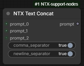
Joins several prompts into a single one. The prompt inputs are a growing set of slots
named prompt_0, prompt_1, … : two are shown to start with, and a new empty slot appears
each time the last one is connected, up to 10. They are connection-only slots (no text
field on the node) and all of them are optional, so any slot can be left unconnected.
Each prompt is stripped of its leading and trailing whitespace before being appended, and prompts that are empty — unconnected, or containing only whitespace — are skipped entirely, so they never leave a stray separator behind. The two separator switches control what is inserted between the prompts already collected and the next one:
comma_separatoradds a,, unless the text collected so far already ends with a comma (a prompt that itself ends with,is therefore not doubled);newline_separatoradds a line break, unless the text already ends with one.
Both switches are independent: with both enabled the prompts are joined by , followed by a
newline; with both disabled the prompts are appended directly, with no separator at all.
Nothing is added in front of the first prompt, and no separator is left at the end.
Inputs
| Input | Type | Description |
|---|---|---|
| prompt_0 … prompt_9 | STRING (optional, connection only) | The prompts to join, in slot order. Slots grow on demand from 2 up to 10; an unconnected slot counts as an empty string and is skipped. |
| comma_separator | BOOLEAN | Insert a , between two prompts (default false). |
| newline_separator | BOOLEAN | Insert a newline between two prompts (default true). |
Outputs
| Output | Type | Description |
|---|---|---|
| prompt | STRING | The concatenated prompts. An empty string when no prompt is connected or all of them are empty. |
DownloadModelsList
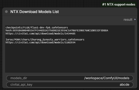
Downloads a list of model files from the internet into the ComfyUI models folder. The list is
typed (or assembled with the Append models picker, see Frontend) in the models_list
textbox, one block per model: the model subpath, an optional hash, and one or more download
urls — the format described in the Example below.
Each model is processed in turn:
- if the file already exists it is skipped — the lookup goes through ComfyUI's own model
paths, so a model found in any folder configured for its type counts as present, not only in
models_dir. When the block declares a hash, the existing file is verified against it and reported as a hash mismatch when it differs; - otherwise the urls are tried in the order they are listed, until one download succeeds; the downloaded file is then checked against the declared hash, if any.
Models are downloaded one at a time. The node is an output node, so it runs when the
workflow is queued even if its result output is left unconnected; like every other node it is
also cached, so queueing again without changing any input does nothing until the list (or one of
the other inputs) changes.
Inputs
| Input | Type | Description |
|---|---|---|
| models_list | STRING (multiline) | The models to download, as blocks separated by empty lines (see Example). Lines starting with # are ignored. |
| models_dir | STRING | Base folder the subpaths are resolved against. When left empty (the default), the ComfyUI models folder is used. |
| civitai_api_key | STRING | Civitai API token, used for downloads that require an account. Optional, and never written to the log (the log only shows its length as asterisks). If left empty, the node will attempt to read the value from the 'tokens' section of the config.yaml file |
Outputs
| Output | Type | Description |
|---|---|---|
| result | STRING | The execution report: totals (processed / downloaded / skipped / failed), the errors, the list of newly downloaded files, and a final status line. |
Example
checkpoints/FLUX/flux1-dev-fp8.safetensors
hash:8E91B68084B53A7FC44ED2A3756D821E355AC1A7B6FE29BE760C1DB532F3D88A
https://civitai.com/api/download/models/1434485

loras/PONY/chars/Zhurong_Dynasty_warriors.safetensors
https://civitai.com/api/download/models/1102934
| Line | Meaning |
|---|---|
| first line of a block | The model subpath, relative to models_dir (e.g. checkpoints/FLUX/flux1-dev-fp8.safetensors). Both / and \ work as separators. |
| hash:… / sha256:… | Optional SHA-256 of the file, used to verify it before and after downloading. |
| any other line | A download url. Several urls can be listed for the same model and are tried in order. |
Blocks are separated by empty lines; the hash line may be omitted, but at least one url is needed for a model that is not on disk yet.
Frontend
Right-click menu options on the node:
- Append models — opens a picker listing the models of a catalogue file, and appends the
chosen ones to the
models_listtextbox. The catalogue isinput/ntx_data/downloads/_full_list.txtand uses exactly the format above, so a block picked there is copied to the node as-is. The same dialog can also append a whole preset list at once (see Download list combobox below). - Save current list as preset — writes the current content of
models_listtoinput/ntx_data/downloads/as a preset, under a name asked for in a dialog (see Saving a preset below).
The picker organises the catalogue by model subpath, split on / and \, into a tree of
folders (checkpoints, loras/PONY/chars, …) with the model files as leaves; folders are
listed before files, both alphabetically. Its controls:
- a checkbox on every row selects models: ticking a folder selects (or clears) everything under it, and a folder whose contents are only partly selected shows a mixed-state box. Clicking a file row toggles it as well, while clicking a folder row expands or collapses it;
- a filter box narrows the tree to the models whose subpath matches the typed text — matching entries stay visible with their folders expanded;
- hovering a model shows its full block (subpath, hash, urls) as a tooltip;
- a Download list combobox under the tree picks a whole preset list (see below);
- a line under the tree counts the current selection and names the picked list, if any, and
Clear selection unticks everything and sets the combobox back to
— none —; - Append (disabled while nothing is selected and no list is picked) confirms, and so does Enter; Cancel, Escape, or a click outside the dialog closes it without touching the node.
The catalogue file is re-read from disk every time the dialog is opened, so models added to it show up without reloading the page or restarting ComfyUI; a warning toast is shown when neither the catalogue nor any preset list holds anything to append.
On confirmation the selected blocks are appended to the end of models_list — in the order they
appear in the catalogue, not the order they were ticked — separated by empty lines and keeping
whatever the textbox already contained. Models that the list already declares are skipped
rather than added twice (subpaths are compared ignoring case and separator style), and a toast
reports how many models were appended and how many were left out as already listed.
Download list combobox
Beside the catalogue, the picker offers the ready-made lists stored in
input/ntx_data/downloads/ as .dwlst files. Each file is a plain list in the format described
above, and each one becomes an entry of the Download list combobox, named after the file
without its extension and followed by the number of models it holds — anima.dwlst is shown as
anima (5). The combobox starts on — none —, and reads — no list found — and stays disabled
when the folder holds no .dwlst file.
Picking a list appends its whole content, in addition to whatever is ticked in the tree: tree selection and list are not exclusive, and either one alone is enough to enable Append. The tree blocks are written first, then the models of the list in their file order. Both go through the same duplicate check, so a model that the textbox already declares — or that the tree selection and the picked list both contain — is written only once, and the toast counts models actually added, not files.
The downloads folder is scanned every time the dialog is opened, so a list saved with
Save current list as preset is offered on the next opening, without reloading the page.
Saving a preset
Save current list as preset turns the current models_list into a new .dwlst file in
input/ntx_data/downloads/, ready to be picked again from the combobox. A warning toast is
shown instead when the textbox is empty.
The dialog asks for the preset name — its title recalls how many models are about to be saved —
and Save (or Enter) writes the file; Cancel, Escape, or a click outside closes
it without writing anything. The .dwlst extension is added automatically, and typing it is
harmless. Names that no filesystem accepts are refused: an empty name, one containing
\ / : * ? " < > |, or one starting or ending with a dot or a space.
When a preset of that name already exists, nothing is written yet: the dialog warns that the
file exists and the button becomes Overwrite, which replaces the file when pressed again.
Editing the name turns the button back into Save, so a confirmation is never carried over to
another file. Names are compared ignoring case, so saving Anima over an existing
anima.dwlst replaces that file — keeping its original spelling — instead of adding a
near-duplicate.
ImagesGrid
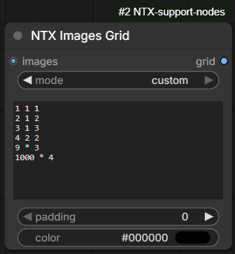
Combines a batch of images into a single grid image. The images are placed in batch order,
left to right and top to bottom, each in its own cell; since all the images of a batch share
the same size, every cell is exactly the size of one input image and the grid is a plain
tiling of them. The mode widget is a dynamic combo: selecting a mode shows only the widgets
that the mode actually uses.
padding is inserted between the cells only — there is no border around the grid, so a
grid of r × c images is c × width + (c - 1) × padding by r × height + (r - 1) × padding
pixels. The whole canvas is filled with color beforehand, which is therefore what shows
through in the padding and in any cell left empty (an RGBA input keeps its alpha channel, and
the filled area is opaque).
When the grid cannot hold every input image — only possible when both dimensions are fixed,
i.e. in rows and columns or with a fully numeric custom layout — the images in excess are
discarded, and the number dropped is written to the log. When the input batch is empty the
node returns a single 1×1 pixel of color.
Inputs
| Input | Type | Description |
|---|---|---|
| images | IMAGE | The batch of images to combine. |
| mode | dynamic COMBO | How the grid size is decided; see the mode list below. Default fixed columns. |
| padding | INT | Gap between the cells, in pixels (0–1024, default 0 = the images touch). |
| color | COLOR | Color picker (default black #000000) filling the padding and the empty cells. |
Modes
fixed columns— widgetcolumns(1–64, default 2). The number of rows is derived from the number of images, so every image always fits.fixed rows— widgetrows(1–64, default 2). The mirror of the above: the number of columns is derived from the number of images.rows and columns— widgetsrowsandcolumns(1–64, default 2). The grid size is exact: fewer images than cells leaves the remaining cells filled withcolor, more images than cells discards the excess.custom— widgetoptions, a multiline text listing several layouts, one per line, so that the grid shape adapts to the number of images. See below.
The custom layout list
Each line of options is a layout written as <max_images> <rows> <columns>, meaning "up to
max_images images, use rows × columns". Either rows or columns — never both — can be
*, meaning "as many as needed" for the number of images actually received. Values are
separated by spaces and empty lines are ignored.
At run time the node picks the first layout of the list whose max_images is greater than
or equal to the number of input images, or the last layout of the list when the images
exceed them all. The order of the lines is the order they are written in — they are not sorted
— so list them from the smallest max_images to the largest.
A line is discarded, with the reason written to the log, when it is not a triad of values,
when a value is not a number, when both rows and columns are *, or when any value is
zero or negative. The other lines still work. If no valid layout is left at all, the node
falls back to a near-square grid (⌈√n⌉ columns) and logs a warning.
Example
The default value of options is:
1 1 1
2 1 2
3 1 3
4 2 2
9 * 3
10 * 4
which gives:
| Images received | Layout used | Resulting grid |
|---|---|---|
| 1 | 1 1 1 | 1 row × 1 column |
| 2 | 2 1 2 | 1 row × 2 columns |
| 3 | 3 1 3 | 1 row × 3 columns |
| 4 | 4 2 2 | 2 rows × 2 columns |
| 5 | 9 * 3 | 2 rows × 3 columns, the last cell filled with color |
| 9 | 9 * 3 | 3 rows × 3 columns |
| 10 | 10 * 4 | 3 rows × 4 columns, the last 2 cells filled with color |
| 11 | 10 * 4 (last one, none fits) | 3 rows × 4 columns, the last cell filled with color |
A line such as 20 3 * reads "up to 20 images, 3 rows and as many columns as needed": with 7
images it produces a 3 × 3 grid, the two spare cells filled with color.
Outputs
| Output | Type | Description |
|---|---|---|
| grid | IMAGE | The composed grid, as a single image (batch of 1); a 1×1 pixel of color when the input batch is empty. |
Primitive
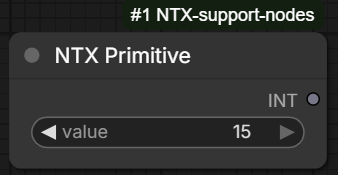
A single constant value whose type is chosen per node: INT, FLOAT, BOOLEAN or
STRING. Instead of picking a different node for each type, one node is dropped into the
graph and its type — plus, for the numeric types, the minimum, maximum and step of its
widget — is set from the Edit primitive right-click dialog. The node then shows exactly
one value widget of the chosen type and an output labelled with that type, so it behaves
like the matching core primitive node.
Every type keeps its own stored value, so switching back and forth never destroys the
others; the value shown is carried over and converted when the type changes (a number becomes
true unless it is zero, false and an empty string become 0, and so on), clamped to the
current minimum/maximum. Changing the type drops the output wires the new type is not valid
for and keeps the compatible ones.
The minimum, maximum and step are a display setting only: they constrain the widget in the
editor, they are not enforced when a value arrives through the input socket. They are shared
between INT and FLOAT (switching between the two carries the range over, rounded to whole
numbers for INT) and are ignored by BOOLEAN and STRING.
Inputs
| Input | Type | Description |
|---|---|---|
| value | INT / FLOAT / BOOLEAN / STRING | The value returned by the node. The widget's type — and, for the numeric types, its range and step — follow the setting chosen in the Edit primitive dialog. Like every widget it can also be driven by a wire. Each type stores its value in its own input (int_value, float_value, boolean_value, string_value); only the selected one is shown, under the name value. |
| primitive_type | COMBO (hidden) | The selected type, managed by the Edit primitive dialog. Never shown on the node. Default: FLOAT. |
Outputs
| Output | Type | Description |
|---|---|---|
| value | INT / FLOAT / BOOLEAN / STRING | The value, typed as the selected primitive type — the output slot is relabelled accordingly (INT, FLOAT, …). |
Frontend
- The node carries one widget per supported type but shows only the one matching the selected
type, labelled
value; the others — and their input sockets — are hidden and cannot be connected.
Right-click menu option on the node:
- Edit primitive — opens a dialog with:
- Type —
INT,FLOAT,BOOLEANorSTRING. - Minimum / Maximum — the widget's bounds, shown for
INTandFLOATonly. Leave a field empty for no limit. - Step — the increment applied by the widget's arrows and by dragging it. Defaults to
1forINTand0.1forFLOAT; forFLOATit also sets how many decimals are shown. - Apply confirms (also Enter), Cancel or Escape closes without changing anything. A minimum greater than the maximum, or a step of zero or less, is refused with a message.
- Type —
LoadImageAndEdit
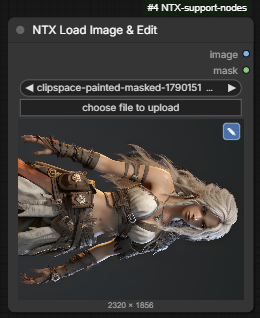
Loads an image from the ComfyUI input folder and returns it together with its mask. The loading half is the standard Load Image: the same file list and choose file to upload button, the same right-click Open in Mask Editor entry, the same image preview, and the decoding itself is delegated to the core loader, so animated formats, EXIF orientation and alpha channels are handled identically.
It adds two things: an image editor on the preview, and a fast paste.
The image editor
A pencil icon sits in the top right corner of the image preview — blue once the picture carries edits. Clicking it opens the editor of the Media Loader's picture slots: rotate by 90°, mirror horizontally or vertically, crop with an optional aspect ratio and size multiple, and a max size limiting the longer side. It is the same editor, the same record and the same pipeline, so a picture behaves the same wherever it is edited in this pack.
The file on disk is never touched. The edits are a record kept in the node's hidden
edit_settings widget, so they serialize with the workflow and travel with a copy of the node. The
preview simply draws the picture through that record; the original is what the node still holds.
When the node runs, the edits are applied to the image and to its mask, in the same order and with the same resampling, so a mask painted in the mask editor still covers what it was painted on. An image with no alpha channel has no real mask — the loader hands back a placeholder — and in that case the node outputs an empty mask of the edited size rather than editing the placeholder.
The mask editor is deliberately untouched: it is the core one and it still opens on the original picture, because the edited version only ever exists as something drawn on the preview. Paint a mask first or edit the picture first, the result is the same.
The record belongs to the picture it was made on, so it is dropped when the image widget moves
to another file — a crop made on a portrait picture means nothing on the next one. The mask editor
is the exception: it writes a clipspace-… derivative of the same picture back into the widget,
with the same dimensions, so the record is carried across it.
For a multi-frame file (an animated GIF or WEBP) the edits are applied to every frame, but the preview shows the edited first frame only.
The fast paste
The second change is what happens when an image is pasted on the node (Ctrl+V with the node selected) — and it changes nothing about what is stored, only how long it takes.
The core node uploads a pasted image into input/pasted, under the image.png, image (1).png,
image (2).png … series, and before choosing a name it compares the incoming bytes with the bytes
of every file already in that series, so the same image pasted twice is stored once. That
comparison re-reads and re-hashes those files on every paste. It costs nothing on a fresh
install and grows with the folder: on an input/pasted holding 1135 images and 3.7 GB, a single
paste reads the whole 3.7 GB and takes 3.6 s warm, 14.5 s cold, during which the ComfyUI server
answers nothing else.
This node keeps the same rule — an image whose bytes are already in the folder is reused rather than stored again — but reads the hashes from a register file kept next to the images instead of recomputing them. A file is hashed once in its lifetime, so a paste costs one hash of the incoming image plus a directory listing: about 3 ms on that same folder, whatever it holds.
Dragging a file onto the node and the choose file to upload button are deliberately left on the core handlers, so they behave exactly like the stock node, destination folder included.
The register file
input/pasted/_ntx_pasted_hashes.txt, one line per image, tab separated:
<sha256> <size in bytes> <mtime in ns> <file name>
The upload route serves the Media Loader's picture slots too, whose Paste picture
from clipboard entry stores into input/ntx_media/. Each folder carries its own register, and the
destination is named by the request among a fixed list of two, so it can never be steered elsewhere.
- It is rebuilt from the folder whenever it does not describe it any more, so images added, renamed or deleted behind its back — by the core Load Image, by another node, by hand — are picked up on the next paste. Only the files it does not already cover are hashed.
- A file whose size or modification time moved is re-hashed rather than trusted, so an image rewritten in place (what the mask editor does) never resolves to a stale hash.
- Deleting it is harmless. The next paste rebuilds it.
- The first paste after the node is installed hashes everything already in
input/pasted, which is the one time the old cost is paid — around 11 s for the 1135-image folder above. A line is logged when more than 20 files are hashed at once, so a long first paste is never a mystery. - It is invisible to ComfyUI: the image lists of the loader nodes and the sidebar only scan the
root of
input, not its subfolders.
Inputs
| Input | Type | Description |
|---|---|---|
| image | COMBO | The image file to load, picked among the images of the input folder, pasted on the node, dropped on it, or uploaded with the choose file to upload button. Files produced by the mask editor are accepted too. |
| edit_settings | STRING (hidden) | The edit record written by the picture editor, as JSON (rotate, mirror_h, mirror_v, crop, max_size). Empty means no edit. Managed by the frontend, not edited by hand. |
Outputs
| Output | Type | Description |
|---|---|---|
| image | IMAGE | The loaded image, with the edits applied when there are any, otherwise whole. |
| mask | MASK | The image's mask, edited the same way; an empty mask of the edited size when the image carries no alpha channel. |
Frontend
- The pencil icon is drawn on the image preview and hidden on a preview too small to hold it
without covering what it is drawn on. The preview widget reads
previewImages ?? node.imgswhen it draws, so the edited picture is handed to it through that argument andnode.imgskeeps the original — which is exactly what leaves the core mask editor working on the original, since it takes its picture fromnode.imgs. - The edited preview is drawn on a canvas, synchronously, at most 1024 px on its longer side. The size caption under the preview reports the edited dimensions, including the max size.
- Only
pasteFilesis taken over, and only on this node — the paste is posted to the addon's own/<API_PREFIX>/load_image/upload_pastedroute, which answers the same{name, subfolder, type}as the core/upload/image. Everything else on the node is core code. - The upload runs on a worker thread on the server, so even the first, hashing paste leaves the ComfyUI server responsive — unlike the core route, which does its hashing on the event loop.
- Should the route fail for any reason, the paste is handed back to the core handler rather
than lost: the image still lands in
input/pasted, the slow way, and a warning is logged in the browser console. - A paste carrying several images loads the first one, like the stock Load Image node.
GroupControl
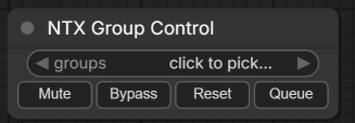
A control panel for the groups of the workflow (found under utils): pick one or more groups by name, then mute, bypass, reset or run them in one click. It is meant for workflows built as a chain of stages — switch a stage off, or run only the stage being worked on, without hunting for its nodes.
The node is virtual: it exists only in the editor and is removed from the prompt when the workflow is queued, so it never executes, costs nothing and cannot change a result. Its buttons act on the canvas the moment they are pressed — a group, and the muted or bypassed state of a node, are editor notions the server never hears about, so they can never be applied during a run.
It acts on the graph it lives in: dropped inside a subgraph, it lists and drives that subgraph's groups. A group holds the nodes whose centre lies inside its frame (the rule LiteGraph itself uses when a group is dragged), nested groups included; the Group Control node is always left out, so a panel sitting inside a group it drives never mutes itself.
The selection is stored by name, so it survives save and reload, travels with a copy of
the node and reads plainly in the workflow file. Two consequences: a name matching several
groups acts on all of them, and renaming a group breaks the link — the stale name keeps
its line in the picker, flagged (missing), so it can be unticked (or the group renamed
back).
Inputs
The node has no inputs — the groups to act on are picked in the groups widget.
Outputs
The node has no outputs — it acts on the canvas, not on data.
Frontend
The groups widget shows the current selection: the group name when a single one is picked,
the names joined when they are short enough, N groups otherwise, and click to pick… when
nothing is selected. Clicking it opens the group checklist:
- one line per group of the graph, marked ✔ when selected; clicking a line toggles it and keeps the menu open, so several groups can be ticked in one pass;
- Select all and Select none;
- a selected name that no longer matches any group is listed last, flagged
(missing).
Four buttons, side by side, act on every node held by the selected groups — which of them a node actually shows is chosen per node (see the right-click menu below), and the row splits its width between whichever are left, so a node kept to a single button gets it full width:
- Mute — mutes them, exactly as Ctrl+M does on a selection: they are left out of the prompt.
- Bypass — bypasses them, as Ctrl+B does: they are skipped and their input is passed through to their output.
- Reset — sets them back to normal, undoing either of the two above.
- Queue — runs only the output nodes those groups hold, plus everything feeding them. Muted and bypassed output nodes are skipped, and output nodes nested inside a subgraph node of the group are included. Only the queued outputs and their ancestors are validated, so an unrelated broken or half-configured node elsewhere in the workflow cannot block the run. The run is queued once, whatever the batch count set in the menu.
Each action answers with a toast: how many nodes in how many groups it changed, or why there was nothing to do — no group picked, none of the stored names exists in this graph, the groups hold no node, or they hold no active output node to run.
Right-click menu options on the node:
- Pick groups… — the same checklist as the widget.
- Buttons shown… — checklist of the four buttons, ticking the ones this node displays
(all four until it is changed). Unticking them all leaves the node with its
groupswidget alone, the row taking no space at all. - Select the nodes of these groups — selects on the canvas every node the picked groups hold.
GroupActionCenter
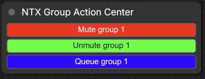
A panel of custom buttons, each playing an ordered list of group actions (found under utils, next to GroupControl). Where GroupControl applies one action to the groups ticked in its widget, a button here carries its own list of steps — a step being mute, bypass, reset to normal or queue, applied to one named group — and pressing it plays them from top to bottom. One button can therefore mute a stage, reset another and queue the result, in one click.
Like GroupControl the node is virtual: it exists only in the editor, is removed from the prompt when the workflow is queued, never executes and cannot change a result. It acts on the graph it lives in (dropped inside a subgraph, on that subgraph's groups); a group holds the nodes whose centre lies inside its frame, nested groups included, and the node itself is always left out. Groups are named, not referenced: renaming one breaks the steps pointing at it, and a step naming a group that no longer exists is skipped and reported instead of stopping the button.
The buttons travel with the workflow and with a copy of the node. Every press answers with a single toast summing up what happened — nodes changed, runs queued, steps that had nothing to do — and listing the group names it could not find. A step that genuinely fails stops the list there, since the steps written after it were meant to run on it.
Inputs
The node has no inputs — everything is defined in its buttons.
Outputs
The node has no outputs — it acts on the canvas, not on data.
Frontend
The node body is the buttons themselves, one full-width row each, drawn in the color given to them (the label text turns dark or light to stay readable, and shrinks when the node is narrowed). A node with no button yet shows a right-click → Add button… hint instead.
Clicking a button plays its steps in order. Queue steps are waited for, so a button
muting a group then queueing another really submits the run with the mute applied, and two
queue steps reach the queue in the written order; the button ignores further clicks until the
run has been submitted.
The available step actions are:
- Mute — mutes the nodes of the group, as Ctrl+M does on a selection.
- Bypass — bypasses them, as Ctrl+B does.
- Reset to normal — sets them back, undoing either of the two above.
- Queue — runs only the output nodes the group holds, plus everything feeding them (muted and bypassed ones are skipped). Only those outputs and their ancestors are validated, so a broken node elsewhere in the workflow cannot block the run, and the run is queued once whatever the batch count set in the menu.
Right-click menu options on the node:
- Add button… — opens the button form on a new button, appended to the node on OK.
- Edit buttons… — opens the list of the buttons of the node.
The button form holds everything about one button:
- Title — what the button shows.
- Color — a checkbox arming a color picker; left unticked the button keeps the default widget grey.
- the action list, played in the order shown: each row picks a group and an action. The group comes from a dropdown of the groups of the current graph, so a step can only target a group that exists; a step whose group has since been renamed or deleted opens with an empty field, waiting for a new pick. Rows are added with + Add action, removed with ✕ and drag-reordered with the handle.
- OK refuses a button without a title, without any action, or with an action missing its group name. Enter confirms, Escape cancels.
The button list (Edit buttons…) shows one row per button — color swatch, title and the number of actions it holds (hover it to read them) — in the order they appear on the node:
- drag-reorder the rows with the handle to change that order;
- ✕ removes a button, Edit… opens the button form on it;
- + Add button appends a new one.
- Nothing is written to the node until OK: Cancel discards the whole session, including the changes made in the button form.
SaveImageToPath
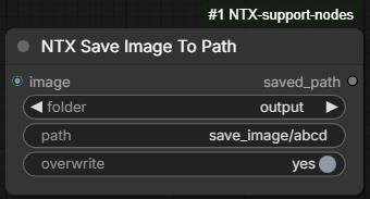
Saves an image exactly where the path says, with no progressive counter and no
date/prefix decoration: the file is always named after path and always written as a
PNG, whatever extension was typed (shot.jpg and shot both become shot.png). A
relative path is resolved against the ComfyUI folder chosen in folder; an absolute path is
used as is, and folder is ignored. Missing intermediate directories are created.
The saved PNG embeds the prompt and the workflow in its metadata, exactly as the standard
Save Image node does (and, like it, honours the --disable-metadata server option), so
dropping the file back on the canvas restores the workflow that produced it.
When the target file already exists it is overwritten if overwrite is on; otherwise the
save is skipped and a warning toast reports the path that was left untouched. Only the
first image of a batch is saved — a counter would have to be appended to write the
others — and a warning is logged when more arrive. The node shows a preview of the saved
image, like Save Image.
Inputs
| Input | Type | Description |
|---|---|---|
| image | IMAGE | The image to save; only the first image of a batch is written. |
| folder | COMBO | ComfyUI folder a relative path is anchored to: input, output (default) or temp. Ignored when path is absolute. |
| path | STRING | Destination file, relative to folder or absolute. The extension is replaced by .png (added when missing). An empty path is an error. |
| overwrite | BOOLEAN | yes (default): an existing file is replaced. no: the save is skipped and a toast warns about it. |
Outputs
| Output | Type | Description |
|---|---|---|
| saved_path | STRING | Full absolute path of the file (normalised, .. segments resolved). Returned also when the save was skipped, since it names the file actually on disk. |
LoadImageFromPath
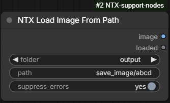
Loads an image from an arbitrary path — typed, not picked from the input folder list —
and returns it as an IMAGE. A relative path is resolved against the ComfyUI folder chosen in
folder; an absolute path is used as is, and folder is ignored. A path without
extension is assumed to be a .png, so the node pairs naturally with SaveImageToPath
(same folder and path on both sides); any explicit extension is kept and every format
PIL can open is accepted. EXIF orientation is applied and the image is converted to RGB;
only the first frame of an animated file is returned.
The node re-runs only when the image changes. Its cache fingerprint is made of the
resolved path plus the file's size and modification time, so it executes when first queued,
whenever folder or path change, whenever the file on disk is rewritten, and after a server
restart — and is served from cache otherwise. While the file is missing, the fingerprint is a
stable marker: the node is not re-run at every queue, but runs again as soon as the file
appears.
When the file is not found (or path is empty) the node does not fail the prompt: it
outputs None as image and False as loaded, so a downstream switch can react to the
missing file. With suppress_errors on (the default) nothing is shown; turned off, a warning
toast File not found: <resolved path> is raised as well.
Inputs
| Input | Type | Description |
|---|---|---|
| folder | COMBO | ComfyUI folder a relative path is anchored to: input (default), output or temp. Ignored when path is absolute. |
| path | STRING | Source file, relative to folder or absolute. .png is assumed when no extension is given. |
| suppress_errors | BOOLEAN | yes (default): a missing file silently yields None. no: a missing file also raises a warning toast. |
Outputs
| Output | Type | Description |
|---|---|---|
| image | IMAGE | The loaded image as a single-image batch; None when the file was not found. |
| loaded | BOOLEAN | True when the file was loaded, False when it was not found. |
SaveVideoToPath
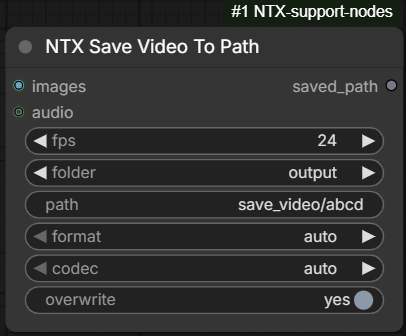
The video counterpart of SaveImageToPath: encodes a batch of frames (plus an optional
audio track) into a video file written exactly where the path says, with no progressive
counter. A relative path is resolved against the ComfyUI folder chosen in folder; an
absolute path is used as is, and folder is ignored. Missing intermediate directories are
created.
The container and codec are chosen with the same format / codec selectors as the native
Save Video node, and the file extension follows the container: whatever extension was
typed in path is replaced by .mp4, .mkv or .webm. With format = auto the container
is webm for the av1 codec and mp4 otherwise. The saved file embeds the prompt and the
workflow in its metadata, as Save Video does (honouring --disable-metadata).
When the target file already exists it is overwritten if overwrite is on; otherwise the
save is skipped and a warning toast reports the path that was left untouched. A file
saved inside one of the ComfyUI folders is previewed on the node; a file saved elsewhere is
not (the frontend can only play files under those folders).
Inputs
| Input | Type | Description |
|---|---|---|
| images | IMAGE | The frames of the video, in order. |
| audio | AUDIO (optional) | Audio track muxed into the file. |
| fps | FLOAT | Frame rate (1–120, default 30). |
| folder | COMBO | ComfyUI folder a relative path is anchored to: input, output (default) or temp. Ignored when path is absolute. |
| path | STRING | Destination file, relative to folder or absolute. Its extension is replaced by the one of the selected container. An empty path is an error. |
| format | COMBO | Container: auto, mp4, mkv or webm. Each choice unfolds the native codec selector (auto, h264, av1 — webm only offers auto / av1), whose re-encode mode exposes the crf quality value. |
| overwrite | BOOLEAN | yes (default): an existing file is replaced. no: the save is skipped and a toast warns about it. |
Outputs
| Output | Type | Description |
|---|---|---|
| saved_path | STRING | Full absolute path of the file, extension included. Returned also when the save was skipped, since it names the file actually on disk. |
LoadVideoFromPath
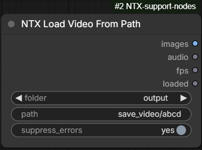
The video counterpart of LoadImageFromPath: loads a video from an arbitrary path and
returns its frames, audio track and frame rate — the same three values Get Video
Components extracts. A relative path is resolved against the ComfyUI folder chosen in
folder; an absolute path is used as is, and folder is ignored.
A path without extension is completed by trying .mp4, .mkv and .webm in this
order, and the first existing file wins — so the node pairs naturally with
SaveVideoToPath (same folder and path on both sides, whatever container was
picked). An explicit extension is kept as typed, and any container PyAV can open is
accepted.
The node re-runs only when the video changes. Its cache fingerprint is made of the
resolved path plus the file's size and modification time, so it executes when first queued,
whenever folder or path change, whenever the file on disk is rewritten, and after a server
restart — and is served from cache otherwise. While the file is missing, the fingerprint is a
stable marker: the node is not re-run at every queue, but runs again as soon as the file
appears.
When the file is not found (or path is empty) the node does not fail the prompt: it
outputs None on images, audio and fps, and False on loaded, so a downstream
switch can react to the missing file. With suppress_errors on (the default) nothing is
shown; turned off, a warning toast File not found: <resolved path> is raised as well (for a
path without extension, the reported name is the .mp4 candidate).
Inputs
| Input | Type | Description |
|---|---|---|
| folder | COMBO | ComfyUI folder a relative path is anchored to: input (default), output or temp. Ignored when path is absolute. |
| path | STRING | Source file, relative to folder or absolute. Without extension, .mp4 / .mkv / .webm are tried in this order. |
| suppress_errors | BOOLEAN | yes (default): a missing file silently yields None. no: a missing file also raises a warning toast. |
Outputs
| Output | Type | Description |
|---|---|---|
| images | IMAGE | The decoded frames as a batch; None when the file was not found. |
| audio | AUDIO | The audio track; None when the video has none or the file was not found. |
| fps | FLOAT | The frame rate of the video; None when the file was not found. |
| loaded | BOOLEAN | True when the file was loaded, False when it was not found. |
SaveLosslessVideoToPath
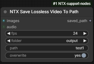
Saves a video without any compression loss, for intermediate results that will be loaded
back into a workflow: instead of an encoded video file, path names a directory that
receives one PNG per frame, the audio track as FLAC and a small info.json holding
the frame rate. This sidesteps the losses of SaveVideoToPath (chroma subsampling of the
video codec, AAC/Opus audio): the frames come back within the 8‑bit rounding of the PNG
conversion and the audio within 16‑bit PCM precision. The counterpart loader is
LoadLosslessVideoFromPath.
Because the node empties a directory when overwriting, the destination is tightly confined:
pathmust be relative and is always placed under<folder>/lossless_video_save/— withfolder=outputandpath=video1/clip1the files go tooutput/lossless_video_save/video1/clip1/. An absolute path is refused.- a
pathcontaining any dot is refused, which rules out./,../and every other way of climbing out of that root (a resolved path that still ends outside it, or on the root itself, is refused too). - an existing directory is only emptied when it is empty or when it was written by this
node (its
info.jsoncarries a marker); a directory holding anything else raises an error and is left untouched.
A refused save shows a warning toast, writes nothing and returns an empty saved_path.
When the directory does not exist it is created (parents included). When it exists and
overwrite is on, its content is deleted and rewritten; with overwrite off the save is
skipped and a warning toast reports it. The node shows a preview of the first frame.
The directory holds:
| File | Content |
|---|---|
| frame_00001.png, frame_00002.png, … | One PNG per frame, in order, without embedded metadata. |
| audio.flac | The first waveform of the audio batch, only when audio is connected (mono, stereo or 5.1 layout). |
| info.json | fps, frame_count, width, height, the frame file pattern, the audio description (file, sample_rate, channels, samples, or null), the save timestamp (ISO) and timestamp_ns (epoch nanoseconds, used by the loader to detect a new save), plus the ntx_lossless_video marker. |
Inputs
| Input | Type | Description |
|---|---|---|
| images | IMAGE | The frames of the video, in order. |
| audio | AUDIO (optional) | Audio track saved as FLAC next to the frames. |
| fps | FLOAT | Frame rate stored in info.json (1–120, default 30). |
| folder | COMBO | ComfyUI folder the directory is placed in: input, output (default) or temp. |
| path | STRING | Directory, relative to <folder>/lossless_video_save. Absolute paths and paths containing dots are refused. An empty path is refused as well. |
| overwrite | BOOLEAN | yes (default): an existing directory is emptied and rewritten. no: the save is skipped and a toast warns about it. |
Outputs
| Output | Type | Description |
|---|---|---|
| saved_path | STRING | Full absolute path of the directory; returned also when the save was skipped. Empty when the save was refused. |
LoadLosslessVideoFromPath
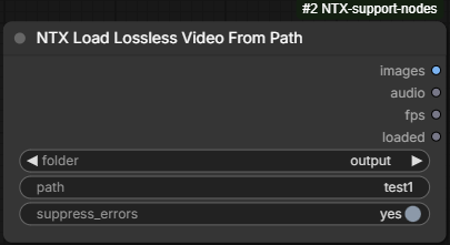
Loads back what SaveLosslessVideoToPath wrote: the frames, the audio track and the frame
rate of the directory given by path, which follows the same rules as the save node —
relative to <folder>/lossless_video_save, no absolute paths, no dots — so the same
folder and path values work on both sides. The frames are read as RGB in their stored
order, the FLAC comes back as a single-item AUDIO batch, and fps is the value stored at
save time.
The node re-runs only when the directory content changes: its cache fingerprint is made
of the resolved directory plus the save timestamp and frame count read from info.json, so
it executes when first queued, whenever folder or path change, after every new save into
that directory, and after a server restart — and is served from cache otherwise. While the
directory is missing, the fingerprint is a stable marker: the node is not re-run at every
queue, but runs again as soon as the directory appears.
Only a directory carrying the loader's info.json marker is recognised. When it is not
found (or path is invalid) the node does not fail the prompt: it outputs None on
images, audio and fps, and False on loaded. With suppress_errors on (the default)
nothing is shown; turned off, a warning toast is raised as well (Directory not found: <dir>,
or Invalid path (<reason>) for a refused path). A directory that exists but has lost some of
its frames or its audio file is a real error and stops the prompt.
Inputs
| Input | Type | Description |
|---|---|---|
| folder | COMBO | ComfyUI folder the directory is looked up in: input, output (default) or temp. |
| path | STRING | Directory written by the save node, relative to <folder>/lossless_video_save. Absolute paths and paths containing dots are refused. |
| suppress_errors | BOOLEAN | yes (default): a missing directory silently yields None. no: a missing or refused directory also raises a warning toast. |
Outputs
| Output | Type | Description |
|---|---|---|
| images | IMAGE | The frames as a batch; None when the directory was not found. |
| audio | AUDIO | The audio track; None when none was saved or the directory was not found. |
| fps | FLOAT | The frame rate stored at save time; None when the directory was not found. |
| loaded | BOOLEAN | True when the directory was loaded, False when it was not found. |
MediaLoader
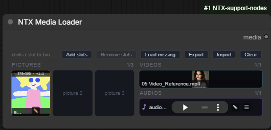
Collects a set of reference media — pictures, videos and audios — in one node, and hands them out as a single NTX_MEDIA_REFS bundle for a downstream node to consume (typically a reference-to-video node that takes several images, clips and sounds at once).
The node is a panel of slots, arranged in rows: each row holds 3 picture slots (on the
left), 1 video slot and 1 audio slot (on the right). A new node starts with 3 rows
(9 pictures, 3 videos, 3 audios); rows are added and removed on the node, down to a minimum of
one. A slot is filled by dropping a file on it or by clicking it, which opens a file
dialog filtered to the slot's kind; the file is uploaded into input/ntx_media/ in the
ComfyUI folder (through the standard upload route, so a file with the same name and content is
reused, and a different file with the same name gets a (1) suffix) and previewed in the slot.
The node never deletes a file: emptying a slot, clearing the node or removing a row only
forgets the reference, and the copies stay in input/ntx_media/.
Pictures, videos and audios can also be edited from their slot (rotation, mirrors, crop, maximum size, time span — see Frontend). The edits are recorded, not applied: the file on disk is left untouched, and the settings travel with the media in the bundle for the consuming node to apply.
A filled slot can also be given a tag — a short name such as face_ref or voice-2 that
lets the consuming node find a media by name rather than by slot position. A tag holds only
letters, digits, _ and - (no spaces or other characters) and is unique on the node,
across pictures, videos and audios and regardless of case (Face and face are the same tag).
The tag belongs to the slot: it stays when the slot's file is replaced, and moves with the file
when the file is dragged to another slot.
The node re-runs only when something changes: its cache fingerprint is made of the slot
contents plus the size and modification time of every referenced file, so it executes when a
slot or an edit changes, when a file is rewritten on disk, and after a server restart. A slot
whose file is missing from the server fails the prompt with
Missing <kind> file in slot <n> : <file> — the Load missing command (see Frontend)
restores such files from a local folder.
NTX_MEDIA_REFS is a dictionary with three lists, pictures, videos and audios, holding
one entry per filled slot, in slot order, plus a tags map:
| Key | Description |
|---|---|
| slot | 0-based index of the slot the entry comes from (gaps are possible). |
| name | The original file name, as shown in the slot. |
| file | The file relative to the ComfyUI folder named by type, e.g. ntx_media/clip.mp4. |
| type | The ComfyUI folder holding the file (input). |
| path | The absolute path of the file on the server, resolved at execution time. |
| edit | The recorded edits, always present with every key (defaults when nothing was edited) — see below. |
| enabled | The slot's on / off toggle (true / false). The loader itself ignores it — a slot switched off is still resolved, validated and output — it is only a flag for the consumer: the MediaSplitter outputs None for a slot that is off. |
| tag | The slot's tag, or None when it has none. |
The tags map indexes the tagged slots by tag: {"face_ref": {"kind": "pictures", "slot": 0}, "voice-2": {"kind": "audios", "slot": 1}} (slot is 0-based, as above; the map is empty when no
slot is tagged). Tags are checked again when the node runs, in case a workflow was edited by
hand: an invalid tag is ignored, and a tag found on several slots is kept on the first one only
(pictures, then videos, then audios, in slot order) with a warning in the console.
The edit record depends on the kind of media, and its keys are meant to be applied in this
order:
- pictures:
rotate(0,90,180or270, clockwise),mirror_h/mirror_v(booleans),crop({x, y, width, height}in pixels of the rotated and mirrored picture, ornull),max_size(longest side in pixels,0for no limit); - videos:
start/end(seconds;endisnullfor "up to the end"), thenmirror_h,mirror_v,crop(in pixels of the mirrored frame) andmax_sizeas for pictures — no rotation; - audios:
start/endonly.
Picture and video records also carry the settings of the editor's crop tool, crop_aspect
(free or one of the ratios below) and crop_multiple (1 to 100): they are the user's
preferences for the slot rather than edits — they do not change the media, and a record holding
only them does not count as edited.
Inputs
| Input | Type | Description |
|---|---|---|
| media_state | STRING (hidden) | Managed by the frontend, not edited by hand: a JSON object with the number of rows and one list per kind (pictures, videos, audios), each slot being null or {name, file, type, edit?, enabled?, tag?} (enabled is only stored, as false, when the slot is switched off; tag only when the slot has one). |
Outputs
| Output | Type | Description |
|---|---|---|
| media | NTX_MEDIA_REFS | The bundle described above. Empty slots are skipped; the lists are empty when nothing is loaded. |
Frontend
The raw media_state widget is replaced by the slot panel. Its top bar holds:
- Add slots — appends a row: 3 picture slots, 1 video slot, 1 audio slot.
- Remove slots — removes the last row (disabled at one row). When a slot of that row is
filled, a confirmation lists the files about to be forgotten; the files themselves stay in
input/ntx_media/. - Auto tags — gives a tag to every filled slot that has none yet, from its kind and
position:
Picture_1,Picture_2,Video_1,Audio_1… When the name is already used by another slot, a letter is appended (Picture_1b,Picture_1c…). Existing tags are left untouched. Disabled when every filled slot is already tagged. - Load missing — checks every loaded file on the server and, when some are missing (a workflow opened on another machine, a cleaned input folder), opens a folder picker: the missing files are looked up by name in the chosen folder and its subfolders (case-insensitively, the original name first, then the stored name) and uploaded from there, the slot keeping its edits. A report then lists the files found on the server, the ones uploaded from the folder (with their source path, and the name they were stored under when it differs) and the ones still missing with the reason. When nothing is missing the report is shown directly, without asking for a folder. Disabled while nothing is loaded.
- Export — opens the browser's folder picker on this machine (the one running the
browser, not the ComfyUI server) and writes every loaded file into the picked folder, along
with a
media.jsondescribing the slots. The browser asks once for permission to save in the folder, and the picker reopens where the last export went. A folder that already holds files is only written into after a confirmation (files of the same name and itsmedia.jsonare replaced). The picker needs a Chromium browser (Chrome, Edge, Vivaldi…) and ComfyUI opened onlocalhostor over HTTPS; elsewhere — or when the browser refuses the picker — the export is downloaded asmedia_<yymmddHHMMSS>.zipinstead, its files inside ayymmddHHMMSSfolder, ready for Import once unpacked. Themedia.jsonholds the samepictures/videos/audioslists as themediaoutput, each entry with itsslot,name, fulleditrecord,enabledstate andtag(when it has one) but without thefile,typeandpathfields, plus the node'srows. Each copy takes its slot's name, made unique inside the folder when two slots share one (the JSON then names the copy). Slots whose file is missing on the server are skipped and listed in the result toast. Disabled while nothing is loaded. - Import — the reverse: opens a folder picker and loads an exported folder into the
node. The folder must hold exactly one
media.json(found even when a parent folder is picked; a folder holding several exports is refused), which is validated before anything changes. When the node holds files, a confirmation asks to replace them. The node is then resized to the JSON'srows(more if an entry's slot needs it), emptied, and every named file of the folder is uploaded like a dropped file — so the slots reference the copies ininput/ntx_media/, not the picked folder — with itseditrecord, on / off state and tag restored (an entry withoutenabled, from an older export, loads switched on). Files that are not in the folder, empty, of the wrong kind, or failing to upload are skipped and listed in the result toast. - Clear — empties every slot, after confirmation.
Loading files
-
Click an empty slot to browse (the dialog only offers the slot's kind: images, videos or audios; several files can be picked), or drop files on it. The first file takes the slot, further files spill over into the next free slots of the same kind; a file of another kind, an unsupported type or an empty file is skipped with a toast, as are files for which no free slot remains.
-
Dropping files on the panel background (outside any slot) fills the first free slots of each file's kind.
-
Dropping on, or clicking, a filled slot replaces its content.
-
Accepted extensions: pictures
png jpg jpeg webp bmp gif tif tiff, videosmp4 mov mkv webm avi m4v mpg mpeg, audioswav mp3 flac ogg m4a aac opus. -
Large video warning — whenever a video lands in a slot (dropped, picked, imported or re-uploaded by Load missing) and whenever its edits are saved in the video editor, the node estimates the memory its frames take once decoded by a MediaSplitter or a MediaParser: kept span × frame rate × frame size after the crop and the max size, in 32-bit floats (the estimate reads the video's metadata only, nothing is decoded). Above 65 % of the media cache (
max_gb_for_media_loader, see MediaSplitter) a warning toast gives the frame count, the frame size and the estimated memory: beyond the whole budget the video is never kept in the cache and is decoded again on every run, and just below it, it pushes everything else out — lower its max size or shorten its span in the video editor. No warning is shown when the cache is switched off (use_for_media_loader: false). -
Paste picture from clipboard, in the node's right-click menu, loads the picture held by the clipboard into the first free picture slot. A clipboard holding no picture is not an error and does nothing; when every picture slot is taken, a toast says so. The picture is stored in
input/ntx_media/like any other, asimage.png,image (1).png… — but through the addon's own upload route rather than the core one, so that series never becomes slow to extend (see LoadImageAndEdit for what that route does and why). Dropped files and the file dialog keep the core route: they carry their own names and never build such a series.Reading the clipboard unprompted needs the browser's
clipboard-readpermission, and plenty of setups simply refuse it: an embedded browser with no permission dialog to ask through, a browser whose clipboard setting is blocked, a page reached over plainhttp://from another machine.When that happens the entry asks for the keystroke instead — a small dialog opens and Ctrl+V pastes the picture, Escape or Cancel closes it. A paste event carries its data with no permission at all, so this path works everywhere. Where the permission is granted the dialog never appears and the entry stays a single click.
Filled slots
- Pictures show a thumbnail (of the edited picture when edits are recorded), videos their first frame — they play, muted, while hovered, mirrored and from the start of their span when edited — and audios a compact player, started at the span's start when trimmed.
- Picture slots show, along their top edge, the size of the edited picture and its aspect
ratio among the ones of the crop tool: the exact one when there is one (
1024×576 · 16:9), the closest one marked≈when it is within 10 % (1000×600 · ≈16:9), nothing beyond that. - × (top-right, on hover) empties the slot.
- T — sets, changes or removes the slot's tag; it sits left of the ●/○ toggle and turns green when the slot is tagged. It opens a small dialog with the current tag: the name is checked as it is typed, and an invalid character or a tag already used by another slot (the message names that slot) keeps Save disabled. Save or Enter records the tag, Remove tag (shown when the slot has one) deletes it, Cancel, Escape or a click outside closes the dialog without changes.
- A tagged slot shows its tag as a green badge in its upper-left corner (the size line of a picture moves just below it); in the shorter audio row the badge leads the row, before the ♪.
- ● / ○ toggles the slot on (full circle) or off (empty circle); it sits left of
the 🔍 on pictures and left of the ✎ on videos and audios. A slot that is off keeps its file
and edits, its preview is greyed out and the toggle stays visible; the loader outputs it
as usual with
enabled: false, and the MediaSplitter outputsNonefor it, as for an empty slot. The state moves with the file when it is dragged to another slot; replacing the file switches the slot back on. - ☰ grip (bottom-right; at the end of an audio row) — hold and drag to move the file to another slot of the same kind; dropping on a filled slot swaps the two. A ghost follows the pointer and the target slot lights up; releasing elsewhere cancels.
- 🔍 (pictures) opens the picture at full size in a lightbox, with its dimensions; close with Close, Escape or a click outside.
- ✎ opens the editor of the slot's kind (below). The pencil is highlighted when edits are recorded, and its tooltip summarizes them.
Picture editor (✎ on a picture)
- ↶ Rotate / ↷ Rotate turn the picture by 90°; ↔ Mirror / ↕ Mirror toggle the mirrors. Rotating or mirroring while a crop exists carries the crop along, so it keeps covering the same pixels.
- ▣ Crop toggles crop mode: drag on the picture to draw the rectangle, drag inside it
to move it, drag one of its eight handles (corners and side midpoints) to resize it —
a side handle keeps the opposite side in place and, when an aspect ratio is set, keeps the
rectangle centred on the other axis. In crop mode two selectors constrain every drag:
aspect (
free,1:1,2:3,3:2,3:4,4:3,9:16,16:9,9:21,21:9) and multiples of (1,2,4,5,8,10,16,32,50,100) — both are honoured exactly at the same time, the rectangle growing in steps of the smallest size satisfying both (e.g.16:9with multiples of32steps by 512×288). Clear crop removes the rectangle. - max size caps the longest side of the output:
max(no limit),512,832,1024,1280,1600,1920or2048. - The info line shows the original size, the size after rotation, the crop rectangle and the resulting output size.
- Reset deletes every edit (the original picture is shown again), Apply records the edits on the slot and closes, Cancel (or Escape) closes without changing the slot.
Video editor (✎ on a video)
- ↔ Mirror, ↕ Mirror, ▣ Crop (with the same aspect / multiples selectors and handles as the picture editor) and max size work on the frames as in the picture editor; there is no rotation.
- The preview shows the frames with the mirrors and the crop overlay applied; click on it (or press Space) to play or pause.
- The timeline under the preview shows the whole video with the kept span highlighted between two bars: drag a bar to move the start or the end (the preview seeks to it), click or drag elsewhere to scrub; the yellow marker is the playhead, whose time is printed on the right. Playback loops inside the kept span. The span cannot be shorter than 0.1 s.
- Transport row: ◀▎ / ▎▶ step one frame (1/25 s) back or forward, ▶ / ❚❚ play or pause, 🔊 / 🔇 toggle the sound, ⇤ start / end ⇥ set the start or the end of the span at the playhead, the two fields take the times in seconds (the kept length is shown next to them), ⏮ First / Last ⏭ jump to the ends of the span.
- keep row: first 1s / 2s / 3s and last 1s / 2s / 3s select the
first or last seconds of the video in one click (the whole video when it is shorter), all
keeps everything; the button matching the current span is highlighted. At its right:
- 📷 Save frame captures the current frame as a PNG (named after the video and the
time, e.g.
clip_2.40s.png), uploads it and loads it in the first free picture slot, adding a row of slots when none is free. The new picture takes over the video's mirrors, crop and max size as its own edits. - ♪ Save audio writes the audio of the kept span as a FLAC file (named after the
video and the span, e.g.
clip_1.00-2.50.flac, extracted on the server at the native sample rate, mono or stereo) intoinput/ntx_media/and loads it in the first free audio slot, adding a row when none is free. A video without audio track reports it instead. - The result, or the error, of the last save is printed in the row.
- 📷 Save frame captures the current frame as a PNG (named after the video and the
time, e.g.
- Reset, Accept, Cancel as in the picture editor.
Audio editor (✎ on an audio)
- The waveform of the file, lit inside the kept span, with the playhead; click on it to seek.
- The same timeline (start and end bars, scrubbing), transport row (◀▎ / ▎▶ step 0.1 s, ▶ / ❚❚, ⇤ start / end ⇥, time fields, ⏮ First / Last ⏭) and keep row (first / last 1s, 2s, 3s, all) as the video editor; Space plays or pauses, playback loops inside the span, minimum span 0.1 s.
- Reset, Accept, Cancel as above.
MediaSplitter
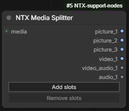
Splits the NTX_MEDIA_REFS bundle of a MediaLoader into one output per slot, with every
media decoded and its recorded edits applied: pictures are rotated, mirrored, cropped and
scaled down to their maximum size; videos are trimmed to their kept span, then mirrored,
cropped and scaled; audios (the audio track of a video, or an audio slot) are trimmed to their
span. The outputs of the empty slots are None, so a downstream switch can react to a slot
left free — and so are the outputs of the slots switched off on the loader (its ●/○ toggle):
for a video slot, both video_n and video_audio_n.
The node shows the outputs of a number of rows of slots — the same rows as the loader — and
this number is changed on the node (see Frontend). For R rows the outputs are, grouped by
kind and in this order: picture_1 … picture_3R (IMAGE), video_1 … video_R (IMAGE, the
frames of the kept span as a batch), video_audio_1 … video_audio_R (AUDIO, the audio track
of the same span, None for a video without one) and audio_1 … audio_R (AUDIO). A new node
starts with 3 rows (18 outputs); the maximum is 10 rows (60 outputs). Slots of the
bundle beyond the node's rows are ignored.
Decoding details: pictures are read with their EXIF orientation applied and converted to RGB (an animated file yields its first frame); video frames are decoded from a little before the span's start and kept while their timestamp is inside it; the maximum size is applied with a Lanczos downscale; audio is decoded at the file's own sample rate, mono or stereo (more channels are mixed down to stereo).
The decoded media are kept in a cache shared by every Media Splitter of the session, keyed
by the file (relative to its ComfyUI folder — the files of input/ntx_media/ are assumed not to
change during a session) and by the edits applied to it (the crop tool preferences do not
count): several splitters fed by the same loader, or the same splitter run again, decode each
file once, and the log marks the outputs served from it with (cached). The cache is bounded by
a byte budget — least recently used items are dropped first, and an item larger than the whole
budget is delivered but not kept, with a warning. Both are set in the cache section of
input/ntx_data/config.yaml: use_for_media_loader (true by default) switches the cache
off altogether when false, and max_gb_for_media_loader (4 by default) is the budget in
gigabytes. Each run logs the cache's item count and size.
Inputs
| Input | Type | Description |
|---|---|---|
| media | NTX_MEDIA_REFS | The bundle of a MediaLoader node. |
| rows | INT (hidden) | Rows of slots the outputs cover (1 to 10, default 3); managed by the frontend through the Add slots / Remove slots buttons, not edited by hand. |
Outputs
| Output | Type | Description |
|---|---|---|
| picture_1 … picture_3R | IMAGE | The edited picture of the slot as a batch of one; None when the slot is empty. |
| video_1 … video_R | IMAGE | The frames of the video's kept span, edited, as a batch; None when the slot is empty. |
| video_audio_1 … video_audio_R | AUDIO | The audio track of the same span; None when the slot is empty or the video has no audio. |
| audio_1 … audio_R | AUDIO | The audio of the slot, trimmed to its span; None when the slot is empty. |
Frontend
The node declares the outputs of the maximum number of rows, untyped; the frontend shows only the ones of the current rows, named and typed as above, in the grouped order.
- Add slots — adds a row of outputs: 3 pictures, 1 video, 1 video audio, 1 audio (disabled at 10 rows).
- Remove slots — removes the last row (disabled at one row). When outputs of that row are connected, a confirmation names them; their wires are dropped when confirmed. The outputs that stay keep their wires while moving to their new position.
Right-click menu options on the node:
- Clean media cache — empties the shared cache of decoded media and frees its memory; a toast reports how many items and megabytes were released.
See MediaToPipe for a variant that delivers the decoded media in a pipe instead of separate outputs.
TextGenerateMultiImage
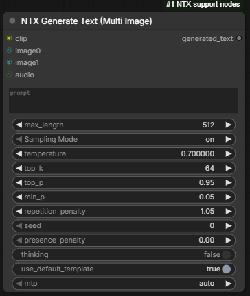
A version of ComfyUI's Generate Text node that sends a language model (a multimodal text
encoder loaded as CLIP) several separate images of different sizes along with the prompt.
The core node takes one IMAGE batch, so all of its images must be the same size. Here, every
image is passed to the model on its own, at its own size and aspect ratio, in slot order:
the first image of image0, then the rest of that batch, then image1, and so on. The prompt
can refer to them as "the first image", "the second image", …
How the images reach the model depends on the text encoder:
- Qwen3-VL / Qwen3.5: each image is given to the model unchanged, and the model scales it itself.
- Gemma 4: each image is resized on its own to fit the model's budget of 280 image tokens (about 0.65 megapixels), keeping its aspect ratio. The core node resizes a whole batch to one size instead.
- Other encoders: the images are joined into one batch, which works only if they are all the same size; otherwise the node stops with an error asking to resize them first. Gemma 3 is built for a single image, so give it only one.
The other settings are the core node's own and behave the same way: they are copied from
Generate Text when ComfyUI starts, so they follow ComfyUI updates. The core video input is
not available; to describe a video, use the core node. The log prints the number of images
and their sizes on each run.
Inputs
| Input | Type | Description |
|---|---|---|
| clip | CLIP | The multimodal text encoder that generates the text. |
| prompt | STRING (multiline) | The request to the model. |
| image0, image1, … | IMAGE (optional) | Up to 16 image slots; a new empty slot appears when the last one is connected. Each slot takes one image or a batch, and every image in it is passed separately. Only the RGB channels are used. |
| audio | AUDIO (optional) | Audio for the models that accept it (Gemma 4). |
| max_length | INT | Maximum number of generated tokens (1 to 32768, default 512). |
| sampling_mode | COMBO | on samples with the settings shown below it: temperature (default 0.7), top_k (64), top_p (0.95), min_p (0.05), repetition_penalty (1.05), seed and presence_penalty (0.0); off always picks the most likely token. |
| thinking | BOOLEAN (optional) | Lets the model reason before answering, when it supports it (default false). |
| use_default_template | BOOLEAN (optional) | Wraps the prompt and the images in the model's chat template (default true). When off, the prompt must contain the model's own image placeholders, or the images are ignored. |
| mtp | COMBO (optional) | Speculative decoding with the model's multi-token-prediction head: auto (default), off, or a fixed draft depth 2 to 5. No effect on models without it. |
Outputs
| Output | Type | Description |
|---|---|---|
| generated_text | STRING | The model's answer. |
ParametricFileName
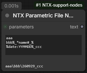
Builds a file name or a path from a text containing named placeholders, filled with the values
of a parameters dictionary. Placeholders are written as %name%; a placeholder whose name is
not found in the dictionary (or whose value is empty) is replaced with an empty string.
Each line of the text is a path segment. Every line has its placeholders replaced on its own
and is stripped of leading/trailing spaces; lines left blank are dropped, and the remaining ones
are joined with the path separator of the operating system (\ on Windows, / on Linux and
macOS). Every / and \ in the result becomes that separator too, and consecutive separators
are compacted into a single one. To keep the text as it is, newlines included, use
ParametricText.
A placeholder can carry a prefix and/or a suffix, written out only when the value is not
empty, so that an unused parameter takes its own separators away with it: * separates the
prefix from the name, # separates the name from the suffix (both characters are reserved and
cannot appear in a parameter name). With char = Mario:
| Placeholder | Result | Result when char is missing or empty |
|---|---|---|
| filename%_*char% | filename_Mario | filename |
| filename%char#-% | filenameMario- | filename |
| filename%_*char#-% | filename_Mario- | filename |
The special name date:FORMAT is not looked up in the dictionary: it inserts the current
date/time, formatted with these tokens (any other character of FORMAT is kept as it is, so it
can be used as a separator):
| Token | Meaning | Token | Meaning |
|---|---|---|---|
| YYYY, yyyy | 4-digit year | MMMM | month name (January) |
| YY, yy | 2-digit year | MMM | short month name (Jan) |
| DD, dd | day of the month | MM | month number |
| DDDD, dddd | day of the year | HH | hour (24-hour clock) |
| mm | minutes | ss | seconds |
hh is accepted as well, but it is a 24-hour clock too, not a 12-hour one.
The placeholder syntax (prefix/suffix and date:) is shared with ParametricText and
ComplexPrompt.
Example
A text of three lines:
renders/%project%
%date:YYYY-MM-DD%
%char#_%portrait
with a parameters dictionary {"project": "demo", "char": "elf"} gives, on Windows,
renders\demo\2026-09-29\elf_portrait. Without a char entry the last line becomes
portrait; without a project entry the first line becomes renders/, and the doubled
separator is compacted: renders\2026-09-29\portrait.
Inputs
| Input | Type | Description |
|---|---|---|
| text | STRING (multiline) | The template: one path segment per line, with %name% placeholders. |
| parameters | DICT (optional) | The {name: value} dictionary used for the replacements. If missing, every non-date placeholder resolves to an empty string. |
Outputs
| Output | Type | Description |
|---|---|---|
| text | STRING | The resulting file name or path. |
Frontend
- The node body shows a read-only one-line result area under the
textwidget, filled with the resulting path whenever the node executes. The content is display-only and is not saved into the workflow or the API prompt; if the node is skipped because its inputs are unchanged (cached), the area keeps its previous content.
ParametricText
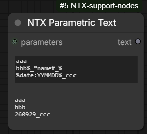
Same as ParametricFileName, for ordinary text instead of paths: only the placeholders are
replaced, with the same syntax (%name%, prefix/suffix, %date:FORMAT%).
Differences from ParametricFileName:
- the lines are not joined into a path: newlines are kept, and so are blank lines and the spaces around each line;
/and\are left as they are, not converted or compacted;- the result area spans several lines and shares the node's height with the
textwidget, so a multi-line result can be read in full.
For example, in the style of %artist%, generated %date:YYYY-MM-DD% with {"artist": "anime"}
gives in the style of anime, generated 2026-09-29.
MediaParser
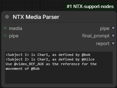
Lets a prompt refer to the media of a MediaLoader by their tags (see MediaLoader). Every
@tag written in the prompt is replaced by a numbered label — <Picture N>, <Video N> or
<Audio N> — and the media behind it are added to a pipe under matching keys, so that the
prompt and the media handed to a multi-reference model agree on the numbering.
How the references are resolved:
- A reference is
@followed by the characters a tag may hold (letters, digits,_,-); it runs as long as such characters follow, so@bob.and@bob,namebobwhile@bob-namesbob-. An@glued to a word before it ([email protected]) is not a reference and is left alone. - Tags are matched ignoring case:
@bob,@Boband@BOBall name the slot taggedBob. - The numbering is per kind, in slot order, from 1, over the referenced slots only — not in
order of appearance in the prompt: if picture slots 2 and 4 are referenced, they become
<Picture 1>/picture_1and<Picture 2>/picture_2, whichever comes first in the prompt. A tag referenced again gets the same label. The resolution is the same as on the MediaSelectByTag. - A label already written in the prompt, such as
<Picture 3>, selects picture slot 3 of the loader too, and is renumbered like the others. - A reference to a tag no slot holds, a label of a slot the loader does not hold, or a slot switched off on the loader fails the prompt; the error lists every unresolved reference at once, with the tags (or slots) the loader does hold.
The media are decoded with their recorded edits applied, exactly as the MediaSplitter
does, and share its cache of decoded media (the Clean media cache entry of the splitter
empties it for both nodes). A referenced video always brings its audio track along, as
video_audio_N next to video_N.
Inputs
| Input | Type | Description |
|---|---|---|
| pipe | DICT (optional) | A pipe the media are added to; a new, empty one when not connected. The input pipe is copied, not modified. |
| media | NTX_MEDIA_REFS | The bundle of a MediaLoader node. |
| prompt | STRING (multiline) | The prompt, referencing tagged slots as @tag. Dynamic prompts are off: {a\|b} is passed through as written. |
Outputs
| Output | Type | Description |
|---|---|---|
| pipe | DICT | The input pipe plus one key per referenced media: picture_N (IMAGE, batch of one), video_N (IMAGE, the frames of the kept span) with video_audio_N (AUDIO, None when the video has no audio track), audio_N (AUDIO). A key already present in the input pipe is overwritten. |
| final_prompt | STRING | The prompt with every reference replaced by its label. |
| report | STRING | One line per referenced slot, per kind in slot order: @tag => pipe keys => slot on the loader (file name) (an untagged slot referenced by its label shows that label instead of @tag); no tag reference in the prompt when there is none. The report is written before the media are decoded, so it does not tell whether a video or audio has sound. The report is also written to the console. |
Example
With a MediaLoader holding picture 1 tagged Alice, picture 2 tagged Bob, picture 4 tagged
Carmen, video 2 tagged video_ref_main and video 3 tagged video_ref_aux, the prompt
<Subject 1> is Char1, as defined by @bob
<Subject 2> is Char2, as defined by @Alice
Use @video_REF_AUX as the reference for the movement of @Bob
gives the final_prompt
<Subject 1> is Char1, as defined by <Picture 2>
<Subject 2> is Char2, as defined by <Picture 1>
Use <Video 1> as the reference for the movement of <Picture 2>
and the report (the file names being those of the slots)
@Alice => picture_1 => image 1 (alice.png)
@Bob => picture_2 => image 2 (bob.png)
@video_ref_aux => video_1 + video_audio_1 => video 3 (aux.mp4)
| Pipe key | Media |
|---|---|
| picture_1 | picture slot 1 (Alice) |
| picture_2 | picture slot 2 (Bob) |
| video_1 | the frames of video slot 3 (video_ref_aux) |
| video_audio_1 | the audio of video slot 3 |
Carmen and video_ref_main are not referenced, so they are not in the pipe.
Frontend
Three buttons on one row above the prompt, Picture, Video and Audio, each list the
tags of the slots of their kind on the MediaLoader connected to media — the one linked directly, or
through Reroute nodes (the core one and this addon's), not through any other node. Only the
tagged slots that are switched on are listed, each with its slot number; the list is read
from the loader when the button is pressed, so it follows the loader's current slots without
running the workflow.
- Hover a picture tag to see its picture in a floating thumbnail, with the slot's rotate / mirror / crop edits applied (video and audio tags have no preview).
- Click a tag to insert
@tagin the prompt at the cursor, replacing the selection if there is one. A space is added before or after the reference when it would otherwise be glued to a word (and so not be read as a reference, or run into the next word). - Escape or a click outside closes the list.
A toast tells when media is not connected to a MediaLoader, or when the loader has no tagged
slot of the button's kind switched on.
See MediaSelectByTag for a variant that keeps the media in a bundle instead of decoding them into a pipe.
MediaSelectByTag
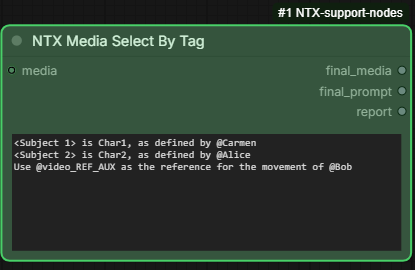
Like MediaParser, it resolves the @tag references of the prompt (ignoring case, with the
same errors for a tag no slot holds or a slot switched off), but instead of decoding the media into
a pipe, it filters the bundle: the output is a new NTX_MEDIA_REFS holding only the
referenced media, renumbered to match the labels of the prompt. Fed to a MediaSplitter,
<Picture N> then comes out on picture_N, <Video N> on video_N and video_audio_N, and
<Audio N> on audio_N.
It works in two steps:
- each
@tagis replaced by the label of its slot on the loader: picture slot 4 taggedCarmengives<Picture 4>; - only the slots the prompt references are kept, renumbered from 1 per kind, in slot order,
and the labels of the prompt are renumbered to match: if picture slots 2 and 4 and video slot 3
are referenced, they become
<Picture 1>,<Picture 2>and<Video 1>.
The numbering therefore follows the slot order, not the order of appearance in the prompt,
exactly as on the MediaParser. A label already written in the prompt, such as <Picture 3>, selects its slot
too, and fails the prompt when the loader has no such slot (no slot of the Media Loader has this number <Picture 3>) or when it is switched off (<Picture 3> is switched off).
Differences from MediaParser:
- no
pipeinput; the outputs arefinal_media,final_promptandreport; final_mediaholds, in each of thepictures/videos/audioslists, only the referenced entries, in slot order, each with itsslotchanged to its new label number minus one (<Picture 1>is slot0); every other field (name,file,path,edit,enabled,tag) is kept as it is. Thetagsmap is rebuilt for the kept entries and their new slots. The input bundle is not modified;- nothing is decoded, so the node is instant and the report cannot tell whether a video has
an audio track (no
(no audio)mark). The report has one line per kept slot, per kind in slot order:@tag => outputs => slot on the loader (file name), where the outputs (picture_1,video_1 + video_audio_1, …) are the MediaSplitter outputs the media land on, and an untagged slot referenced by its label is shown by that label instead of@tag.
With the loader and the prompt of the MediaParser example, the final_prompt is
<Subject 1> is Char1, as defined by <Picture 2>
<Subject 2> is Char2, as defined by <Picture 1>
Use <Video 1> as the reference for the movement of <Picture 2>
the report
@Alice => picture_1 => image 1 (alice.png)
@Bob => picture_2 => image 2 (bob.png)
@video_ref_aux => video_1 + video_audio_1 => video 3 (aux.mp4)
and final_media becomes (other fields omitted):
{
    "pictures": [ {"slot": 0, "tag": "Alice"}, {"slot": 1, "tag": "Bob"} ],
    "videos":   [ {"slot": 0, "tag": "video_ref_aux"} ],
    "audios":   [],
    "tags": {
        "Alice":         {"kind": "pictures", "slot": 0},
        "Bob":           {"kind": "pictures", "slot": 1},
        "video_ref_aux": {"kind": "videos",   "slot": 0}
    }
}
Alice (picture slot 1) and Bob (picture slot 2) keep their order and become <Picture 1> and
<Picture 2>; video_ref_aux (video slot 3) is the only video, so it becomes <Video 1>.
Frontend
The same Picture, Video and Audio buttons as on the MediaParser (see its Frontend section).
MediaToPipe
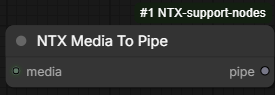
Same as MediaSplitter — every slot of the bundle is decoded with its edits applied, through
the same shared cache — but the media come out in a single pipe instead of one output per
slot. Its media input takes the bundle of a MediaLoader or of a MediaSelectByTag.
Differences from MediaSplitter:
- one output,
pipe(DICT), with one key per media named after its slot, numbered from 1: picture slot 0 ispicture_1, picture slot 2 ispicture_3, video slot 1 isvideo_2(the frames) withvideo_audio_2(its audio track,Nonewhen it has none), audio slot 0 isaudio_1; - empty slots and slots switched off have no key (rather than a
Noneoutput), and the console notes how many slots were switched off; - no
rowssetting and no row limit: every slot of the bundle is decoded, however many rows the loader has.
Fed by a MediaSelectByTag, the keys follow the labels of its prompt, since that node has already
renumbered the slots: <Picture 1> is picture_1, <Video 1> is video_1 + video_audio_1.
Media nodes: function map
How the execute() functions of the media nodes call the functions of py/media_loader.py.
The two prompt functions only rewrite the prompt and filter the bundle; every decoding goes
through media_to_pipe.
flowchart TD
    parser["MediaParser<br/>execute()"]
    select["MediaSelectByTag<br/>execute()"]
    topipe["MediaToPipe<br/>execute()"]
    splitter["MediaSplitter<br/>execute()"]

    resolve["resolve_prompt_tags<br/>@tag to loader label"]
    extract["extract_used_media<br/>keep, renumber, report"]
    m2p["media_to_pipe<br/>decode into a pipe"]
    layout["split_layout<br/>output names"]

    parser --> resolve
    parser --> extract
    parser --> m2p
    select --> resolve
    select --> extract
    topipe --> m2p
    splitter --> m2p
    splitter --> layout

    classDef nodeexec fill:#EEEDFE,stroke:#534AB7,color:#3C3489
    classDef func fill:#E1F5EE,stroke:#0F6E56,color:#085041
    class parser,select,topipe,splitter nodeexec
    class resolve,extract,m2p,layout func
resolve_prompt_tags and extract_used_media also use slot_label, normalize_tag and
is_enabled; extract_used_media writes its report through log_report. The
MediaH3Script (py/media_h3_script.py) parses its prompt_base with the same three
functions as the MediaParser, and calls decode_slot directly for start_video and
guide_video.
The decode chain under media_to_pipe:
flowchart TD
    m2p["media_to_pipe<br/>each requested slot"]
    decode["decode_slot<br/>one media, by kind"]
    normalize["normalize_*_edit<br/>clean edit settings"]
    cache["cached_media<br/>file + edit cache"]
    stats["log_media_cache_stats<br/>cache usage"]
    picture["load_picture<br/>image file"]
    video["load_video_frames<br/>kept span frames"]
    audio["load_audio_span<br/>audio of a span"]
    frames["apply_frame_edits<br/>rotate, mirror, crop"]
    pyav["decode_audio_span<br/>PyAV audio decode"]

    m2p --> decode
    m2p --> stats
    decode --> normalize
    decode --> cache
    cache -. cache miss .-> picture
    cache -. cache miss .-> video
    cache -. cache miss .-> audio
    picture --> frames
    video --> frames
    audio --> pyav

    classDef path fill:#E1F5EE,stroke:#0F6E56,color:#085041
    classDef io fill:#FAECE7,stroke:#993C1D,color:#712B13
    classDef helper fill:#F1EFE8,stroke:#5F5E5A,color:#444441
    class m2p,decode,cache path
    class picture,video,audio io
    class normalize,stats,frames,pyav helper
decode_slot hands the loader of the slot's kind to cached_media, which runs it only when the
file and its edits are not cached yet (dotted arrows). Green: the decode path; orange: the
functions reading a file; gray: helpers.
MediaLoader decodes nothing: its execute() reads the widget with parse_media_state, the
tags with slot_tags, and builds each entry with annotated_name and the normalize_*_edit /
is_*_edited helpers. The web routes of the frontend commands use extract_audio
(decode_audio_span, write_flac, safe_name, unique_path), export_zip (export_plan)
and estimate_video_frames.
MediaH3Script
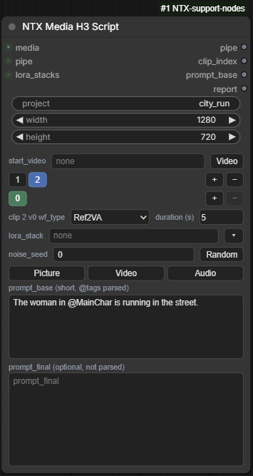
Holds the script of a video made of several clips, each one generated by its own run. The
general settings of the video (project, width, height) sit at the top of the node; below
them, a tabbed panel holds the clips, numbered from 1, and each clip holds one or more
versions, numbered from 0. A version carries all the settings of the clip: workflow type,
duration, LoRA stack, noise seed and prompts. Versions let you keep alternative takes of the same
clip and switch between them.
A run works on the active version of the active clip — the tabs selected on the node. It puts
the general settings and the fields of that version into the output pipe, after parsing
prompt_base exactly as the MediaParser does: every @tag is replaced by its
<Picture N> / <Video N> / <Audio N> label, numbered per kind in slot order, and the
referenced media are decoded into the pipe (see MediaParser for the numbering rules, the
decoding and the errors). As with MediaParser, a reference to a tag no slot holds, or to a slot
that does not exist or is switched off, fails the prompt. prompt_final is
not parsed: it is passed as written, and when it is empty (or holds only spaces and newlines)
it gets the parsed prompt_base instead.
The version's lora_stack names an entry of the lora_stacks input — typically one of the
LORA_STACK inputs of a PipeCustom node. When the name is found, that stack goes into the pipe
as lora_stack; when the field is empty, or the name is not in lora_stacks (or lora_stacks
is not connected), there is no lora_stack key and the console shows a warning for a name not
found. The name is matched exactly, spaces around it ignored. Note that a PipeCustom only holds
the inputs that are connected, so an unconnected stack2 is "not found".
start_video is a setting of the whole script, not of a clip: the tag of a video slot of the
MediaLoader that the first clip continues. On a run of the first clip (clip_index 1), that
video's frames and audio track — with the slot's edits applied, decoded as by the MediaParser —
go into the pipe as context_frames and context_audio.
The tag is matched ignoring case, like the @tag references. A tag no slot holds, a tag held by a
picture or audio slot, or a video slot switched off fails the prompt (the error lists the
video tags the loader holds). When start_video is empty, or on any later clip, it is ignored —
not even checked.
guide_video is also a setting of the whole script: the tag of a video slot of the MediaLoader
whose frames guide the clips. On every run, whatever the clip_index, that video's frames —
with the slot's edits applied — go into the pipe as guide_main_frames (its audio track is not used). The
tag is checked like the one of start_video, and an empty guide_video is ignored.
Each clip takes its own share of the guide video, its guide length: length −
context_frames_length of its active version (0 at least). The clip's guide_main_frames are
the guide_length frames starting at frame guide_used_frames, the sum of the guide lengths of the
clips before it (each with its active version); when the video runs out, its last frame is repeated
to fill the missing ones. guide_main_idx is set to the clip's context_frames_length, the index
where the guide frames start in the clip.
For example, with every clip at length 124 and context 22 video + 24 audio, each clip takes
102 frames: clip 1 frames 0–101, clip 2 frames 102–203, clip 3 frames 204–305, each
with guide_main_idx 22.
Switching tabs changes the node's inputs, so the next run picks up the newly selected clip or version.
Inputs
| Input | Type | Description |
|---|---|---|
| media | NTX_MEDIA_REFS | The bundle of a MediaLoader node, the media prompt_base refers to. |
| pipe | DICT (optional) | A pipe the settings and media are added to; a new, empty one when not connected. The input pipe is copied, not modified. |
| lora_stacks | DICT (optional) | A pipe of LORA_STACK entries (usually from a PipeCustom), the versions picking theirs by name. |
| project | STRING | The identifier name of the video project. Default empty. |
| width | INT | The width of the video: 64–8192, step 16, default 1280. |
| height | INT | The height of the video: 64–8192, step 16, default 720. |
| clips_state | STRING (hidden) | Managed by the frontend, not edited by hand: a JSON object with start_video, guide_video, the clips, the index of the active clip, and in each clip its versions and the index of its active version. |
Setting of the script (on the clip panel):
| Field | Type | Description |
|---|---|---|
| start_video | STRING | The tag of the MediaLoader video the first clip continues; empty for none. Default empty. |
| guide_video | STRING | The tag of the MediaLoader video whose frames guide every clip; empty for none. Default empty. |
Fields of a version (on the clip panel):
| Field | Type | Description |
|---|---|---|
| wf_type | COMBO | The type of workflow of the clip: T2VA, I2VA, L2VA, FL2VA or Ref2VA. Default T2VA. |
| duration | FLOAT | The duration in seconds, 2 decimals: 0.01–600, default 5. Changing it sets length to 5 + 17 × ceil((max(5, round(duration × 24)) − 5) / 17). |
| length | INT | The number of frames of the duration, of the form 5 + 17k: 5–14404, default 124. A typed value is rounded up to the next valid one (123 → 124, 125 → 141). Changing it sets duration to length / 24, rounded to 2 decimals. |
| context | COMBO | The motion context the clip continues with: none, 22 video + 24 audio or 39 video + 48 audio. Default none. The node reads the two lengths from the text, so any entry of the form <N> video + <M> audio works. |
| lora_stack | STRING | The name of an entry of lora_stacks; empty for none. Default empty. |
| noise_seed | INT | The noise seed: 0–18446744073709551615, default 0. |
| prompt_base | STRING (multiline) | The short prompt, suitable for further enhancement, referencing tagged slots of the MediaLoader as @tag. |
| prompt_final | STRING (multiline) | An optional longer prompt, passed as written. |
Outputs
| Output | Type | Description |
|---|---|---|
| pipe | DICT | The input pipe plus: project, width, height, clip_index (from 1), version_index (from 0), wf_type, duration, length, context_frames_length and context_audio_length (the video and audio values of context, 0 for none), noise_seed, prompt_base (parsed), prompt_final (as written, or the parsed prompt_base when empty), lora_stack (only when found), the media referenced by prompt_base under the MediaParser keys (picture_N, video_N + video_audio_N, audio_N), and for the first clip with a start_video, context_frames (IMAGE, the frames) and context_audio (AUDIO, None when the video has no audio track), and with a guide_video, guide_main_frames (IMAGE, the clip's share of the frames) and guide_main_idx (INT, the clip's context_frames_length). Keys already present in the input pipe are overwritten. |
| clip_index | INT | The number of the active clip, from 1. |
| prompt_base | STRING | The parsed prompt_base, references replaced by their labels. |
| report | STRING | The MediaParser report of the references of prompt_base (one line per referenced slot, per kind in slot order; no tag reference in the prompt when there is none), followed for the first clip with a start_video by a line start_video <tag> => context_frames + context_audio => video N (file name), and with a guide_video by a line guide_video <tag> => guide_main_frames => video N (file name), L frames from frame U. |
Example
With picture 1 of the MediaLoader tagged MainChar, clip 2 version 0 active, prompt_base
set to
The woman in @MainChar is running in the street.
and prompt_final left empty, the pipe gets
| Pipe key | Value |
|---|---|
| clip_index | 2 |
| version_index | 0 |
| prompt_base | The woman in <Picture 1> is running in the street. |
| prompt_final | The woman in <Picture 1> is running in the street. |
| picture_1 | the picture of slot 1 (MainChar) |
Frontend
The clip panel replaces the clips_state widget. From top to bottom:
start_video— a text field, with a Video button that lists the tagged video slots of the MediaLoader connected tomedia: the same list as the Video tag button above the prompt (see the MediaParser Frontend section), but clicking a tag copies it into the field. The tag can always be typed, changed or erased by hand.guide_video— right understart_video, the same text field and Video button.- Clip tabs — one button per clip, numbered from 1; the active one is blue. + adds a clip
at the end, with a single version 0 taking the workflow type, duration, length and context
of the active version (the other fields start empty / at
0), and selects it. − removes the active clip; it asks for confirmation when any of its versions has prompt text, and is disabled when only one clip is left. Hovering a tab shows its active version's workflow type and duration. - Version tabs — one button per version of the active clip, numbered from 0; the active one is green. + adds a version at the end, a copy of the active version (all its fields), and selects it. − removes the active version; it asks for confirmation when the version has prompt text, and is disabled when only one version is left. Each clip remembers its own active version.
wf_type,durationandlength(changing one recomputes the other), with a label naming the clip and version being edited (e.g.clip 2 v0).context— a combo, on the left oflora_stackon the same row.lora_stack— a text field, with a ▾ button that lists the LORA_STACK inputs of the PipeCustom connected directly tolora_stacks(not through reroutes); clicking one fills the field. The name can always be typed, changed or erased by hand. The button does nothing whilelora_stacksis not connected, and a toast tells when it is connected to something other than a PipeCustom, or to a PipeCustom without LORA_STACK inputs.noise_seed— a number field, with a Random button that draws a new seed the same way the RandomSeed node does (a value from0up to, but not including,2^53 - 1).- Picture, Video and Audio — the same tag buttons as on the MediaParser (see its
Frontend section), except that the chosen
@tagalways goes intoprompt_base, at its cursor, whichever prompt field had the focus:prompt_finalis not parsed, so a reference there would not be resolved. prompt_baseandprompt_final.
Right-click menu options on the node:
-
Create upstream nodes — creates and connects the nodes feeding the node's inputs that are not connected yet, in a column on its left, placed clear of the nodes already there (one undo step):
medianot connected: a MediaLoader, onmedia;- neither
widthnorheightconnected: an ImageResolution set to the node's width and height, onwidthandheight(skipped when either one is already connected); lora_stacksnot connected: a PipeCustom with three LORA_STACK inputsstack1,stack2,stack3, itspipeonlora_stacks, and a LoraStack on itsstack1.
A toast lists the nodes created, or tells that everything is already connected.
LoadH3MotionContextLatent
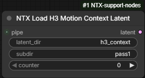
Loads the latent a clip continues from, for the context_latent input of the H3 Motion
Context node of the H3-Motion-Context extension, which must be installed
(the run fails with an error naming it otherwise). The node works out the file from the pipe of a
MediaH3Script, so a chain of clips needs no manual renumbering: it is the companion of
SaveH3MotionContextLatent, which writes the files it reads.
The clip_index of the pipe is the clip being generated; the latent loaded is the one of the
clip before it, saved as
<ComfyUI output folder>/<latent_dir>/<project>/<subdir>/clip_<clip_index - 1, 5 digits>.safetensors
where project comes from the pipe; an empty latent_dir, project or subdir is skipped, and
spaces around each are ignored. When the file exists, it is loaded through the extension's H3
Motion Context Load Latent node, with that folder as latent_path and clip_index - 1 as
clip_index.
- For the first clip (
clip_indexof1or less, or none in the pipe) there is nothing to continue from:latentisNone. - A missing file is not an error:
latentisNone, and the console shows a warning with the path that was looked for.
ComfyUI reuses the node's previous result as long as its inputs are unchanged, and the pipe is
seen as unchanged while its settings are; change counter to make the node run again — for
instance when it returned None because the previous clip's file was not saved yet.
Inputs
| Input | Type | Description |
|---|---|---|
| pipe | DICT | The pipe of a MediaH3Script, giving clip_index and project. |
| latent_dir | STRING | The folder of the saved latents, relative to the ComfyUI output folder. Default h3_context. |
| subdir | STRING | A subfolder of <latent_dir>/<project>. Default empty (skipped). |
| counter | INT | Not used: change it to force the node to run again, regardless of the cache. Default 0. |
Outputs
| Output | Type | Description |
|---|---|---|
| latent | LATENT | The latent of the previous clip, for the context_latent input of H3 Motion Context only (it is not a decodable latent); None for the first clip or when the file is missing. |
Example
With latent_dir = h3_context, subdir = pass1 and a pipe holding project = city_run:
| Pipe clip_index | latent |
|---|---|
| 1 | None |
| 2 | output/h3_context/city_run/pass1/clip_00001.safetensors |
| 3 | output/h3_context/city_run/pass1/clip_00002.safetensors |
SaveH3MotionContextLatent
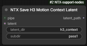
Saves the AV latent of the clip just generated, so that the next clip's LoadH3MotionContextLatent can continue from it. It requires the H3-Motion-Context extension, whose H3 Motion Context Save Latent node does the saving (the run fails with an error naming the extension when it is missing).
The folder is built exactly as by LoadH3MotionContextLatent — <latent_dir>/<project>/<subdir>
under the ComfyUI output folder, project coming from the pipe, the empty parts skipped — and the
extension's node is called with <folder>/clip as filename_prefix and the pipe's clip_index.
The file is therefore
<ComfyUI output folder>/<latent_dir>/<project>/<subdir>/clip_<clip_index, 5 digits>.safetensors
the one LoadH3MotionContextLatent reads when the pipe moves on to the next clip. Saving a clip again (a re-roll) overwrites its own file, so a rejected attempt is never picked up later.
When the pipe has no clip_index (or 0), the extension's auto mode applies instead: a new
file numbered by run, with a trailing underscore (clip_00001_.safetensors). Such files are never
read by LoadH3MotionContextLatent, since their numbers count runs, not clips.
The node is an output node: it saves even when nothing is connected to latent_path.
Inputs
| Input | Type | Description |
|---|---|---|
| pipe | DICT | The pipe of a MediaH3Script, giving clip_index and project. |
| latent | LATENT | The sampler's output latent of the clip (an H3 AV latent: video and audio streams). |
| latent_dir | STRING | The folder of the saved latents, relative to the ComfyUI output folder. Default h3_context. |
| subdir | STRING | A subfolder of <latent_dir>/<project>. Default empty (skipped). |
Outputs
| Output | Type | Description |
|---|---|---|
| latent_path | STRING | The full path of the saved file. |
Example
With latent_dir = h3_context, subdir = pass1 and a pipe holding project = city_run and
clip_index = 2, the latent is saved as output/h3_context/city_run/pass1/clip_00002.safetensors;
generating clip 3 next, LoadH3MotionContextLatent with the same settings loads that file.