
CMYK Magic
Custom-ink halftone for ComfyUI. Pick any set of inks plus a paper colour and the node solves per pixel for the best mix of those inks, screens each plate at its own angle and stacks them in print order. 17 patterns, 37 presets, real Ben-Day plate rendering and tint calls.
ComfyUI-CMYK-Magic
Retratone-style custom-ink halftone for ComfyUI. Instead of a fixed CMYK separation, you pick any set of ink colors (up to 8) plus a background/paper color, and the node solves, per pixel, for the best mix of those inks to rebuild your image. Each ink plate is then screened with a print pattern at its own angle and the plates are stacked in print order with an ink blend that sits anywhere between opaque paint and pure multiply, like real ink on paper.
Fully procedural pure-torch, seeded, resolution-aware. No dependencies.
Works with both node renderers: the classic canvas and the new Vue nodes.
Visual guide
Every preset, pattern, slider and randomisation control, shown on a real image
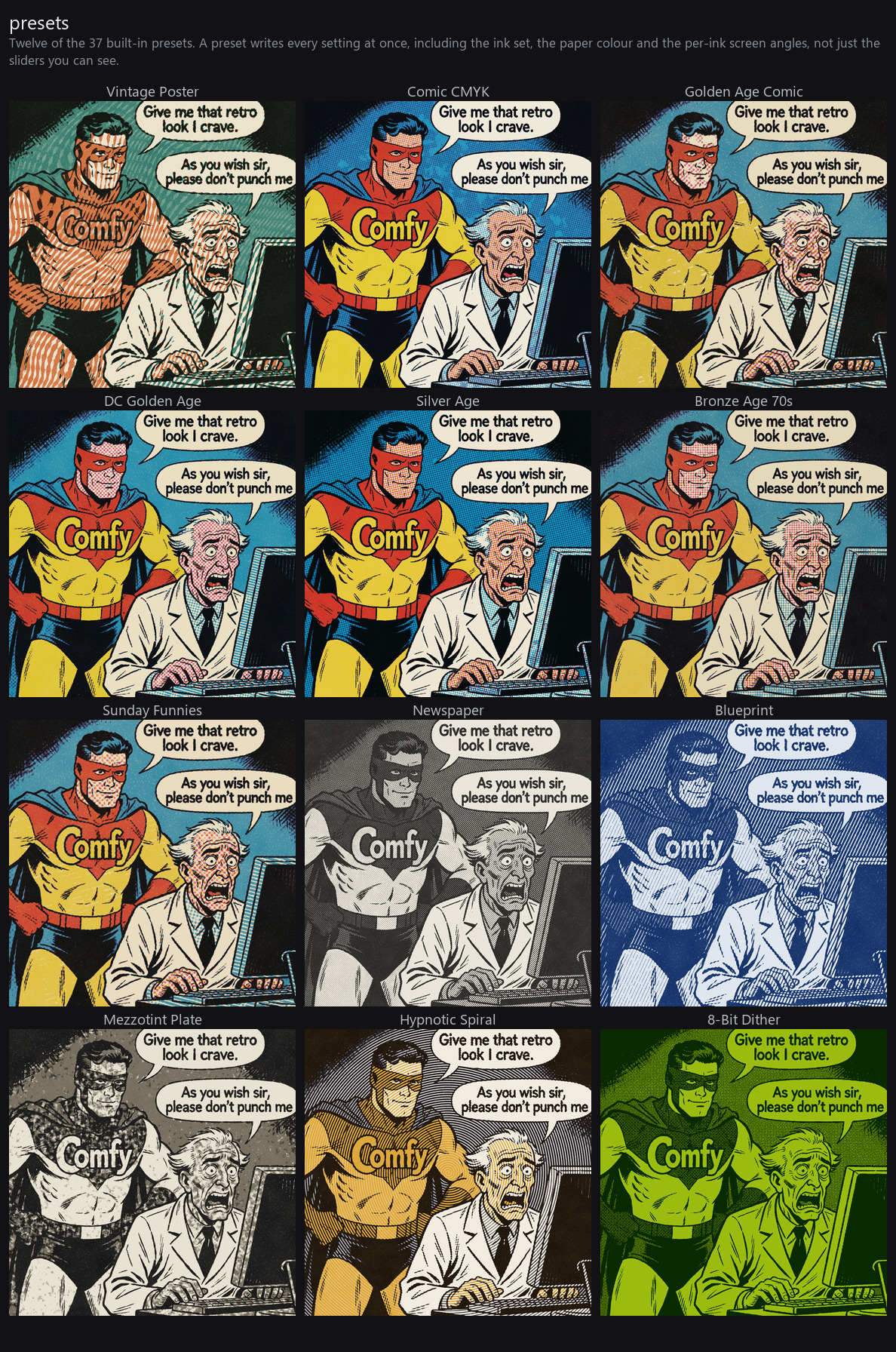
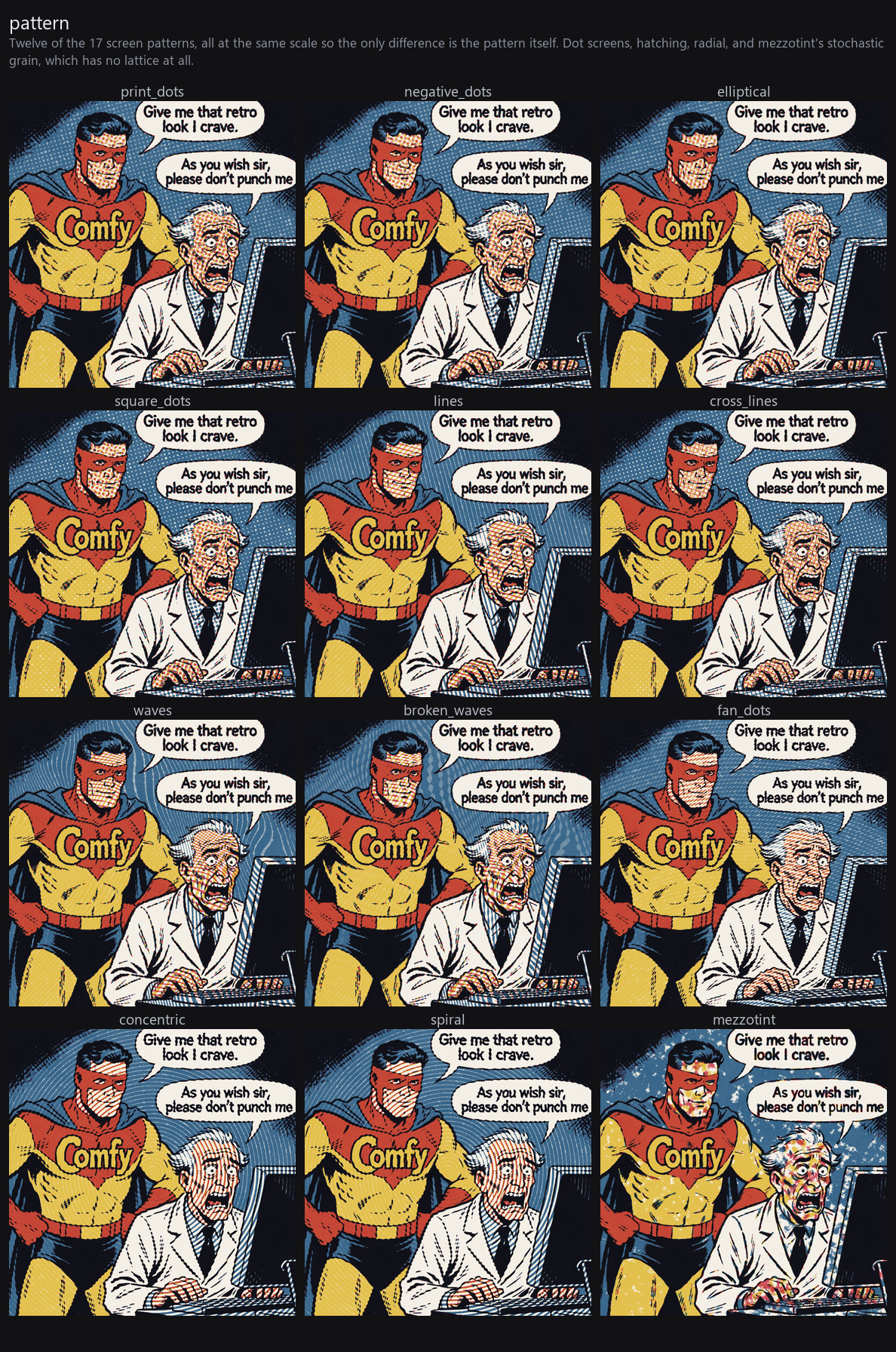
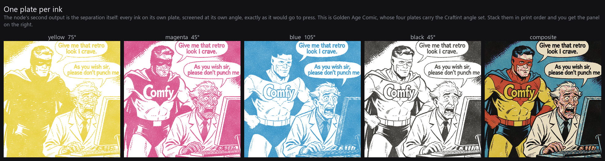
The second output is the separation itself: one plate per ink, screened at its own angle, stacked in print order. This is what makes it behave like ink rather than like a filter, and it is covered in why this reproduces the real process.
Regenerate the whole set against your own image with
python docs/generate_docs_images.py your_image.png.
Node: CMYK Magic (image/print_look)
| Input | What it does |
|---|---|
| preset | 37 built-in looks. Picking one loads its settings into the widgets and stays selected; tweaking anything flips it back to Custom. Headless, a preset name overrides the widgets directly. |
| pattern | 17 styles. Dot screens: print dots, negative dots, elliptical (chain dot), square dots. Hatching: lines, broken lines, cross lines, waves, broken waves, cross waves. Radial: fan dots, concentric rings, spiral. Plus mezzotint (stochastic grain, no lattice), bayer (hard-thresholded ordered dither), solid (no screen, flat ink fields, keeps type sharp), and random, which picks a fresh pattern from the seed each run. Waves are concentric contour flows (fingerprint-like curves), not periodic wiggles; broken variants chop into stitch dashes that join into continuous lines in dark areas. |
| scale | Pattern size. 60 = fine print, 400 = giant pop-art shapes |
| roughness | Distresses the screen from clean press to worn analog |
| brightness / contrast | Pre-grade before separation |
| ink_multiply | 0 = opaque paint, 100 = pure multiply. In between = the half-opaque "plasticol" mix real inks have |
| ink_fade | Worn, mottled ink density |
| dot_gain | Ink spread on absorbent stock: a called tint prints heavier than film. 0 = calibrated press (a 20% call inks exactly 20%), 100 = newsprint letterpress (20% grows to ~36%, the historical comic figure) |
| plate_drift | Random per-ink misregistration (px) |
| offset_angles | Screen-angle step between successive inks (60° default); an ink's angle field overrides its own screen absolutely |
| rotate | Rotates the whole screen set |
| plate_render | benday makes each plate carry several screens at once like a real Ben-Day plate, light tints as dots, deep tints as a line/hatch sheet, 100% as an unscreened solid fill. Pair with a tint_quantize setting so the bands land on the colourist's tint calls. |
| tint_quantize | Snap every plate to the tint percentages a colourist could call for. 25/50 is what Craftint and the Silver Age acetate system both offered (4 levels ^ 3 primaries = the 64-colour comic palette); 25/50/75 adds the call that arrived in the early 1980s; 20/50 and 10/20/50/70 are alternative step sets. Flat stepped fields, no gradients |
| ink_config | The ink set, managed by the visual panel below |
Presets: Vintage Poster, Rose Matinee, Surf Poster, Poster Shop, Free of Charge,
Strange Process, Comic CMYK, Golden Age Comic, Craftint Golden Age, DC Golden Age,
Silver Age, Bronze Age 70s, Ben-Day Workshop, Sunday Funnies, Chain Dot Press,
CMYK '74, Charles Brown, Desert Etching, Cigar Club, Folk Festival, Early Days,
Jungle Tour, Jewel Thief, Orange Crate, Gallery Stipple, Glam T-Shirt,
Mezzotint Plate, Aquatint Sepia, Op Art Record, Hypnotic Spiral, Pixel Press,
8-Bit Dither, Blueprint, Newspaper, One-Pass White, Crosshatch, Hand Toned.
Defined in magic_presets.py, where you can add your own.
The comic presets model the real pre-digital letterpress process: authentic screen angles per plate (the 1948 Yearbook set Y 75°, M 45°, C 105° for the Craftint era; Y 90°, M 75°, C 105°, K 45° for the Silver Age), tint-call quantization, and heavy plate drift for the off-register look.
What a preset actually sets
A preset writes every setting below, not just the visible sliders, so loading one and then reading the widgets tells you most, but not all, of the story. In full, a preset controls:
| Where | What |
|---|---|
| Widgets | pattern, scale, roughness, brightness, contrast, ink_multiply, ink_fade, dot_gain, plate_drift, offset_angles, rotate, plate_render, tint_quantize |
| Panel | ink colours + print order, paper colour, Color Match / Tint mode, opaque bottom ink |
| Per ink | angle (absolute screen angle), freq (line frequency), solid_only, pattern |
The per-ink fields used to be invisible. Tick Per-ink angle / freq in the panel to show a second line under each ink exposing its angle, frequency and solid-only flag, then nothing a preset does is hidden.
seed is never touched by a preset.
The three comic eras
Researched against Guy Lawley's Ben Day Dots history (parts 8, 9a, 9b). Comic colour was never dots-at-every-level: the colourist had exactly three calls per primary: 25%, 50% and solid, which is where the 64-colour palette comes from, and each era rendered those calls differently.
All four eras share the same tint_quantize 25/50: three calls per primary
was the constant. What separates them is how those calls were rendered
(plate_render) and how the plates were angled:
- Craftint Golden Age (c.1938-55):
plate_render: benday, so 25% prints as square-grid dots, 50% as a diagonal line sheet, 100% as painted-in solid. Dots and lines sat in perfect register on one pre-printed board. Angles per the 1948 Yearbook: Y 75°, M 45°, C 105°. - DC Golden Age: same process, but DC left yellow tints out entirely
until 1969 (yellow could only print solid), halving the palette to 32
colours and making every caucasian face flat pale magenta instead of
Marvel's magenta+yellow. That's the per-ink
solid_onlyflag. - Silver Age (Marvel 1954, DC 1956 to the 80s): the acetate method, so
plate_render: uniform: there are no line tints at all. The 50% call is rendered by the same dot screen at a heavier exposure, which past 50% turns into negative dots, round holes in ink. Nothing else changes. - Bronze Age 70s: same again, but with
offset_angles: 0. Mid-70s the engraver's cheaper camera screened every colour at the same angle. No rosette, visibly coarser colour.
Ben-Day Workshop goes further and models how engravers actually worked. A
single plate carried several patterns at once, masked by tint level, a light
sky in 20% dots, a shirt in 50% dots, a deep shadow in parallel lines, and
full-strength areas simply cut out of the mask for unscreened solid ink. It
also runs yellow coarse (freq 0.6), because fine yellow tints blurred away
on newsprint so publishers leaned on solid fills and coarse line screens, and
keeps the heavy inks coarser than the black plate, which carried the line art.
Mixing a dot screen on one plate with a line screen on another was also the
standard trick for avoiding moiré where two mid tints overlapped.
A tuning rule the presets follow: hatch looks (lines/waves) keep
offset_angles small (6-12°) so every ink strokes in the same direction,
like a hand-pulled print; wide offsets (30-60°) are for dot rosettes and
CMYK-style screens. Crossing line plates at wide angles turns hatching into
a woven tangle.
Palettes & per-run randomization
The panel has an Ink palette… dropdown (18 palettes: process CMYK sets,
riso complementary pairs, triads, duotones: PALETTES in
magic_presets.py) that applies colors + paper to the current settings, and
a 🎲 button that applies a random one immediately.
Randomize per run checkboxes (stored in ink_config.randomize) re-roll
parts of the look from the seed on every generation, set the seed widget to
randomize and each run is a new look, yet any result can be reproduced by
fixing its seed:
- Inks: draws a random palette per run
- Paper: random paper stock (with Inks on, uses the palette's own paper)
- Ink pat.: random per-ink patterns (mixed-pattern looks)
The main pattern widget's random option does the same for the pattern.
Anything unchecked stays fixed at its current value.
Preset shuffle: hit Shuffle above the preset gallery to switch it into
selection mode, tick any number of presets, and one is drawn per run. The
count line tells you which mode you are in, ticked presets carry a check
badge, and All / None fill or clear the list. The list is stored in
ink_config.randomize.presets, so it saves with the workflow; clearing it
turns the shuffle off. While a shortlist is active the live preview labels
itself with whichever preset it drew.
Per-ink locks: each ink row also has 🎲c / 🎲p toggles that re-roll only
that ink's color / pattern per run, e.g. keep Y, M, K fixed and let just the
blue roam. Rolled colors come from the palette pool, so they stay
print-plausible. (JSON: rnd_color / rnd_pattern on the ink.)
Outputs: image (the print) and plates, one separation per ink on
white, in print order (ink-major batch), like Retratone's Convert to Layers.
The panel
The node draws its own interface: a live preview beside collapsible sections, so it stays about 340px tall with everything shut and grows only as you open what you need.
Live preview. Rendered server-side by the real engine (preview.py) on
this node's own last executed input, so it cannot disagree with what the node
outputs, the panel and the node share one settings resolver
(cmyk_magic.resolve_settings). Before the node has run it falls back to a
built-in test card. One request is in flight at a time and changes coalesce, so
it self-paces to whatever the machine can do while you drag a slider.
Galleries. Presets and ink palettes are pickable by eye rather than by name. Preset thumbnails are real engine renders of the test card, cached one per preset for the life of the server; palette swatches are drawn client-side.
Help strip. Every control writes a plain-English explanation into the strip
under the preview on hover, sliders, segments, patterns, presets, palettes,
per-ink buttons and the dice. Text lives in help_text.py and the per-preset
lines in PRESET_DESC.
Dice on any slider. The 🎲 beside a slider re-rolls that setting on every
run, inside a range you set (starts at the slider's full range). Stored in
ink_config.randomize.sliders, resolved from the seed like every other random
choice, so a diced look is still reproducible by fixing the seed.
Layout. Presets and patterns run the full width; the ink list and the two slider groups sit side by side beneath them, so the panel is wide rather than long. Sections collapse and remember their state in the workflow, and the node resizes to whatever you have open. A manual resize is remembered, so the panel never claws its width back.
Colour is borrowed from ComfyUI itself: the panel reads the host's widget colours at runtime and falls back to neutral greys, using tone only to mark what is selected or active. The inks and the preview supply the actual colour.
The ink panel
The bundled web extension replaces the raw JSON widget with a panel on the node: a pattern picker with drawn thumbnails, Color Match / Tint mode toggle, background color, and an ink list with color swatches, a per-ink pattern dropdown (mixed-pattern looks: e.g. black ink in cross lines, orange in waves, see the Hand Toned preset), enable/disable, reorder (print order, first ink prints first, at the bottom), add/remove, and Auto Sort (light first, dark on top).
- Color Match: solves per-pixel coverage for every ink so the stack
reproduces the image as closely as your ink set allows. Swap an ink and the
whole image re-separates around it. Print order matters when
ink_multiplyis below 100, exactly like a real press. - Tint: gradient-map mode: each ink lives at its own darkness on the shadows→highlights axis (paper = the ink-free node). Two inks = duotone; four dark inks at stepped angles = stacked crosshatch.
- Opaque bottom ink: forces the first ink to normal blend, like a solid white base coat on a black shirt (set the background dark, bottom ink white).
If the panel isn't available (headless, API), ink_config is plain JSON.
Per ink: color, on, optional pattern (per-ink pattern id), angle
(absolute screen angle), freq (line-frequency multiplier, 0.15-4; below 1 is
coarser), solid_only (this ink never prints a tint, only 0 or 100%) and
pos (0..1 tint position override):
{"mode": "color_match", "background": "#f4efe6", "opaque_bottom": false,
 "inks": [{"color": "#e8c547", "on": true, "pattern": "waves"},
          {"color": "#1b1b25", "on": true}]}
Notes
- Dots are Euclidean. Ink grows as circles up to 50%; past 50% the paper becomes circles, round negative dots in a grid of ink. That is what a real contact halftone screen does, and why Silver Age comics show holes rather than blobs in their darker tints. A plain distance-to-centre dot leaves four-cusped gaps above 50% and reads digital.
- The screen is tone-calibrated. Screen fields aren't uniformly
distributed (a raw round-dot threshold inks ~1.77x the requested area) and
the anti-aliased dot edge adds area of its own, enough at small pitch that
a blank plate still printed grey.
screen_lutmeasures each field's real inked-area response and inverts it, so requested coverage == printed area for every pattern and 0% coverage prints nothing. Ink spread is now a deliberate effect viadot_gainrather than an uncontrolled artifact. - The separation is exact coordinate descent: the composite is affine in each ink's coverage, so each update is a closed-form least-squares solve (3 sweeps).
- Pair with ComfyUI-Print-Look (Paper Print / Canvas presets) for paper texture on top; this node deliberately stops at the ink layer.
- Pattern pitch auto-scales with image size, so previews and upscales match.
Layout
__init__.py        registration (+ WEB_DIRECTORY + /cmyk_magic/presets route)
engine.py          separation solver, pattern screens, ink compositing
cmyk_magic.py      the node class + ink_config parsing
magic_presets.py   the preset library
web/cmyk_magic.js  the node panel (pattern picker + ink manager + preset loader)
Installation
Clone into your ComfyUI custom_nodes folder and restart:
cd ComfyUI/custom_nodes
git clone https://github.com/marcsole96/ComfyUI-CMYK-Magic.git
No extra dependencies. Everything is pure torch and runs on whatever ComfyUI
already has installed, CPU or GPU. The only thing it takes from ComfyUI itself
is device selection, so it follows your usual --cpu / GPU setup.
Licence
MIT, © 2026 Marc Solé.
A note on AI assistance
This node was built with the help of generative AI (Claude), and so was the work of getting it onto GitHub: sorting out the licence and gitignore, and writing the sections above. The look itself, the print research behind the presets and the decisions about what the thing should do are mine.