
ComfyUI-SimpleFloatSlider
ComfyUI custom nodes providing styled draggable float and integer slider widgets
Nodes (3)
ComfyUI Simple Float Slider
Three custom ComfyUI nodes that replace the default number widget with a styled, draggable slider and a prominent live value display.


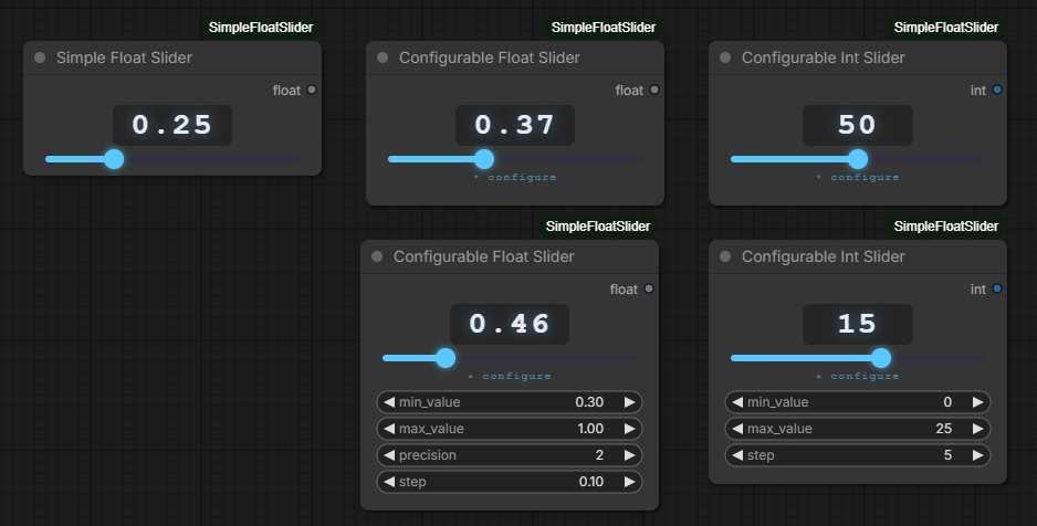
Nodes
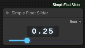
Simple Float Slider
A fixed-range slider with no configuration required.
| Widget | Type | Description |
|--------|------|-------------|
| value | slider | Drag to adjust. Click the number to type a value directly. |
| Output | Type | Description |
|--------|------|-------------|
| float | FLOAT | Current value, rounded to 2 decimal places |
- Range:
0.00–1.00 - Step:
0.01 - Precision: 2 decimal places
Configurable Float Slider
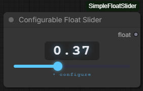
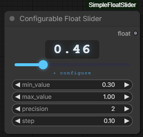
A fully configurable slider. All settings update the slider live — no re-queuing needed. Configuration fields are hidden by default behind a ▾ configure toggle.
| Widget | Type | Default | Description |
|--------|------|---------|-------------|
| value | slider | 0.5 | Drag to adjust. Click the number to type a value directly. |
| min_value | float | 0.0 | Lower bound of the slider range |
| max_value | float | 1.0 | Upper bound of the slider range |
| precision | int (0–4) | 2 | Number of decimal places shown in the display |
| step | float | 0.01 | Increment size when dragging or scrolling (revealed by ▾ configure) |
| Output | Type | Description |
|--------|------|-------------|
| float | FLOAT | Current value, clamped to [min, max] and rounded to precision decimal places |
Note:
precisionandstepare independent. You can display 2 decimal places while stepping in increments of0.25, for example.
- See Stepping for how
stepinteracts with typed values.
Configurable Int Slider
An integer slider with a configurable range and step size. Configuration fields are hidden by default to keep the node compact.
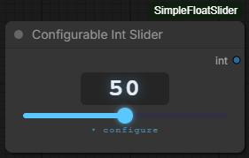
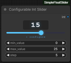
| Widget | Type | Default | Description |
|--------|------|---------|-------------|
| value | slider | 50 | Drag to adjust. Click the number to type a value directly. |
| min_value | int | 0 | Lower bound of the slider range (revealed by ▾ configure) |
| max_value | int | 100 | Upper bound of the slider range (revealed by ▾ configure) |
| step | int (≥1) | 1 | Increment size when dragging or scrolling (revealed by ▾ configure) |
| Output | Type | Description |
|--------|------|-------------|
| int | INT | Current value, clamped to [min, max] |
- Click
▾ configureto expand the min/max/step fields; click▴ configureto collapse them again. stepis an integer of at least1, so the slider only ever moves in whole numbers.- See Stepping for how
stepinteracts with typed values.
Slider UI
All three nodes share the same widget style:
- Large value display — monospace, centered at the top of the node. Click it to type a value directly; press
Enterto confirm orEscapeto cancel. - Mouse wheel — hover over the value display or anywhere on the slider track and scroll to nudge the value. Scroll up to increase, scroll down to decrease. All three nodes increment by their configured
stepsize; the Simple Float Slider is fixed at0.01. The page canvas will not scroll while the pointer is over the slider. - Draggable range slider — color-filled track: blue left of the thumb, dark right. The fill updates live as you drag.
- Collapsible configuration — the Configurable Float Slider and Configurable Int Slider both hide their settings fields behind a
▾ configuretoggle by default; click it to expand or collapse them.
Stepping
Applies to the Configurable Float Slider and the Configurable Int Slider. In short: you sit on the grid unless you deliberately type your way off it.
- Changing
stepre-grids. Whenever you edit thestepfield, the current value snaps to the nearest multiple of the new step measured frommin_value. So if you never type a value, the slider always lands on tidy multiples —min,min + step,min + 2 × step… - Typing sets the value exactly, even if it doesn't sit on the grid. Type
37on an int slider withstep5and you get exactly37. - Dragging and scrolling step from wherever the value is. Continuing the example,
37moves to42,47,52… or32,27… — it does not jump onto the 35/40/45 grid. While the value is on the grid this is indistinguishable from stepping frommin, which is why untouched sliders behave exactly as they always have. min_valueandmax_valueare always reachable. Clamping happens after the step is applied, so a grid that would overshoot the bound still lets you land on it exactly.
To get back onto tidy multiples after typing an off-grid value, re-enter the step value — that re-grids from min_value.
Installation
- Clone or copy this folder into your ComfyUI
custom_nodesdirectory:
ComfyUI/
└── custom_nodes/
    └── ComfyUI-SimpleFloatSlider/
        ├── __init__.py
        ├── nodes.py
        └── js/
            └── slider.js
-
Restart ComfyUI.
-
All three nodes appear under utils/sliders in the node search.
Requirements
- ComfyUI (any recent version with custom node support)
- No additional Python packages required
Changelog
v1.1.2
- Configurable Int Slider — new
stepwidget — sets how far the value moves when dragging or scrolling. Defaults to1, and is an integer of at least1, so the slider is always restricted to whole numbers. It sits alongsidemin_valueandmax_valuein the collapsible configuration panel, mirroring thestepwidget the Configurable Float Slider already has.- Existing saved workflows load unchanged and pick up the default
stepof1.
- Existing saved workflows load unchanged and pick up the default
- Changed: stepping is now relative to the current value — on both configurable sliders, typing a value sets it exactly even when it falls between steps, and dragging or scrolling then increments from that value. Typing
37withstep5moves to42/32rather than onto a fixed 35/40/45 grid. Editing thestepfield snaps the value back onto the nearest multiple measured frommin_value, so a slider you never type into behaves exactly as it did before. See Stepping.- The slider thumb now always sits on the displayed value. Previously a typed value falling between steps left the thumb parked on the nearest step while the number read something else.
- Configurable Int Slider — toggle renamed — the
▾ set rangebutton is now▾ configure, matching the Configurable Float Slider. The old label no longer described the panel accurately now that it holdsstepas well as the range.
v1.1.1
- Fixed: saved settings were ignored when loading a workflow — the Configurable Float Slider and Configurable Int Slider rebuilt themselves with their default range on load, so a saved
min_value,max_value,precisionorstephad no effect on the slider until you nudged each field and moved it back. The configuration fields displayed the correct saved numbers the whole time, which made the mismatch easy to miss. The slider now reads the restored configuration once the workflow finishes loading. - Fixed: values outside the default range were lost on load — because the slider still held its default bounds while the saved value was being restored, the value was clamped to those defaults. A node saved as
value: 7.5withmax_value: 10.0reloaded as1.0. The value is now clamped only against the configuration it was actually saved with.- Workflows already re-saved after being clamped have the reduced value stored on disk and cannot be recovered automatically.
- Changed: narrowing a range is no longer destructive — lowering
max_valuebelow the current value clamps the display as before, but raising it again restores the original value instead of leaving it stuck at the lower bound. Dragging, scrolling or typing a value still replaces it outright.
v1.1.0
- New node: Configurable Int Slider — a styled integer slider under
utils/sliders. OutputsINT. Defaults to range0–100.- Min and max are configurable directly on the node via a
▾ set rangetoggle button that expands/collapses the range fields, keeping the UI clean during normal use.
- Min and max are configurable directly on the node via a
- Configurable Float Slider — the four configuration fields (
min_value,max_value,precision,step) are now hidden by default behind a▾ configuretoggle button, consistent with the new int slider behaviour. - Mouse wheel support — on all three nodes, hovering over the value display or the slider track and scrolling up/down increments or decrements the value. Scroll up increases the value, scroll down decreases it. The Configurable Float Slider steps by its configured
stepvalue; the Simple Float Slider steps by0.01; the Configurable Int Slider steps by1. The canvas will not scroll while the pointer is over the slider.